If you ever doubt about the suggestive power of Alice in Wonderland, just wait for a minute and consider that we’re still in chapter 1 and we have already been drowned in pictures and interpretations of the striking visual images Carroll concocts in those pages.
Drink me
We were left with the glass table and the golden key, which is – and it’s important that you remember this – above the table.
The white rabbit has disappeared behind a door that’s too small for Alice to squeeze through, into a wonderful garden only few artists had the inspiration to show us, and Alice is clueless on how to proceed, even if she has clear in her mind that the solution might be to «shut up like a telescope». By returning to the table, she finds a bottle that was not there before, and there’s no mention of the key.
this time she found a little bottle on it (“which certainly was not here before,” said Alice), and tied round the neck of the bottle was a paper label, with the words “DRINK ME” beautifully printed on it in large letters.
Lewis Carroll himself drew Alice looking at the bottle within the original manuscript of Alice’s Adventures Under Ground, as the tale was originally titled, which he gave Alice Liddell as a Christmas present in 1864.
The bottle is described after medicine bottles in the Victorian Era and is one of the most used props when it comes to Alice. Tenniel gives us an illustration of the scene, and Carroll was certainly right when he complained that the artist drew «several pictures of “Alice” entirely out of proportion—head decidedly too large and feet decidedly too small». That’s one ugly child, over there.
The picture was later fixed by the same author for The Nursery “Alice” (1889) a shortened version for children up to five years old, adapted by the author himself. The book was published by Macmillan and it featured, alongside some recoloured and revised illustrations by Tenniel, new illustrated front and back covers by E. Gertrude Thomson, a Glasgow-born artist who was a friend of Carroll. For him she also did Three Sunsets and Other Poems, but her most incredible work probably is her stained glass, particularly the Britomart Windows at Cheltenham Ladies’ College, based upon Edmund Spenser’s Faerie Queene.
Alice looking at the bottle is not one of the favoured moments by other artists. It’s worth mentioning this unconventional Alice by Elena Korobkova, who looks more like Mafalda than the lice we’re usually thinking about. Her eyes are completely in the shade and appear black and hollow, which is really really adorably creepy.
Some artists choose to focus on it when they’re showing the whole sequence, to make up for the lack of animation in illustration.
It’s the case of Eric Kincaid and his 1993 edition (you can still find some copies on sale here). His Alice is particularly lovely in her dress, but if I have to choose a favourite feature I’ll pick the resignation and despair with which she’s drinking from that bottle as if it’s absinthe.
Shutting down like a telescope
What follows in the book is one of the most iconic shrinking / growing moments and, as I was saying while collecting pictures of the glass table, that gets illustrated a lot, almost as much as the fall, the tea party and Alice growing up too much in the rabbit’s house. The topic, for some reason, particularly fascinated the Russian illustrators. There’s a blog dedicated to these illustrations, where Alice is changing sizes, and you can find it here. It’s one of the main sources for this Sunday collection.
Alice’s emotions are a bit of a mix, here: she’s surprised, and then she looks up and tries to reach to the key that was left (or most likely reappeared) on the top of the table, and then she falls into desperation. Artists usually pick one of these and go with it. Fanny Y. Cory, the American cartoonist of Little Miss Muffet, goes with despair for this black and white illustration from 1902.
Peter Newell, the American artist who worked on Alice in 1901 for Harper & Brothers. There’s a good article on his work here, where we get some insights on his work.
When the book first appeared, critics were guardedly supportive of Newell’s Alice illustrations. The New York Times conceded that although “the Tenniel pictures used to be thought inseparable from the text,” Alice and “her strange associates are refreshing and interpretive in a new way.” Newell himself admitted that Tenniel’s “appreciation of the many grotesque personages peopling this wonderland are sympathetic, and his work will live as long as Alice. It may appear presumptuous therefore on my part to portray what Alice means to me.” But despite the artist’s reservations, he was able to apply his own brand of whimsy and humor to this most sacred of texts, bringing a kind of domesticated Wonderland home to America.
You can find all his illustrations here, for instance.
A desperate Alice is also the angle Irina Kazakova decides to take, only she changes the perspective and gives us a view from the top, with the key and a raven-haired Alice crying her eyes out. Her illustrations for Alice in Wonderland are incredible and always playing on contrast, with a limited palette of black and shades of purple.
A desperate Alice is also what we find in the illustration of an artist known as Van Hutchings, whose name and coordinates I was unable to find.
His bottle is not much like the Victorian medicine bottle Carroll describes, but I like the perspective distortion of the hallway in the background.
The Russian artist Victor Chizhikov, on the other hand, shows us a less dramatic moment, with Alice reaching for the glass leg of the table and probably wondering if the still can reach the key. One of the things I love most about this picture is the enlarged perspective, with a distorted pavement and the lantern light to increase the oddness of the situation.
Chizhikov, to be fair, gives us both scenes: before…
…and afterwards.
The scene is precisely the same, only the bottle is empty and the light changes: one has to assume it’s because Alice is not blocking it anymore (or at least I like to think that the artist thought about that).
The most famous historical Alice reaching out, is probably Brinsley Lefanu‘s, a guy I’ve already talked about in correlation with Undine. He was the main illustrator for W.T. Stead‘s paperback collection Books for the Bairns, which included versions of Alice in 1907. Brinsley was one of the children of novelist Joseph Sheridan Le Fanu, the ghost story writer behind Carmilla.
Among contemporary artists, Zdenko Basic did a version of Alice in Wonderland in 2009 and you can still find some used copies around. His mixed technique style goes well with the choice of showing up a improperly opened door towards the garden, the shrunk up Alice, the realistically depicted glass table and, most importantly, a close-up of a label that seems to show a lot more side-effects than a simple “drink me”.
Margaret Tarrant‘s Alice is a lot more proactive, however, and we see her trying to climb the glass leg.
Go, Alice, go!
Almost 50 years later, the Czech graphic designer, illustrator and painter Dagmar Berková was still going with the same idea, adding a little twist with snakes on top of the table. His illustrations have a very limited palette which, as you know, is something I generally like a lot. You can see some pictures here, though the year quoted here is much more recent than the one I found.
A fearless Alice climbing quite high and against all odds is an approach Disney considered for their cartoon that was supposed to come out in 1939: we can see some of the early sketches by David Hall going this way, with both Alice trying to retrieve the key and the bottle spilling drops on her from the top of the table.
The first concept shows us Alice climbing and sliding along the glass table’s leg, which is rather different than the usual three-legged table and gives us a beanstalk feeling that would have been nice, although the three-legged table carries a significance related to seances and rituals of connecting with the dead.
Hall stays consistent with this idea throughout all his sketches, if you remember the concepts I showed you last week. This last scene is a bit mysterious: maybe they wanted to use the same bottle both for shrinking her and for enlarging her, an idea I’m glad they abandoned.
It’s worth mentioning that these illustrations are from 1939, while the movie we all know came out in 1951. Like for many other projects, it got shelved because of the war and because Walt was not really satisfied, but David Hall had already made a shitload of sketches. From what we can see, the 1939 version was purer, without the contaminations between Wonderland and Through the Looking Glass that we see in the 1951 movie, and Hall was going for a much darker tone.
Emma Chichester Clark‘s Alice also doesn’t seem to be willing to put up with this bullshit and she’s trying to climb the glass leg. This illustration appeared within an edition published in 2009 by Harper Collins and we have already seen her dynamic Alice falling through the Rabbit Hole.
But the first one to pick this moment has to be Charles Robinson, in 1907, and his Alice seems to be almost there.
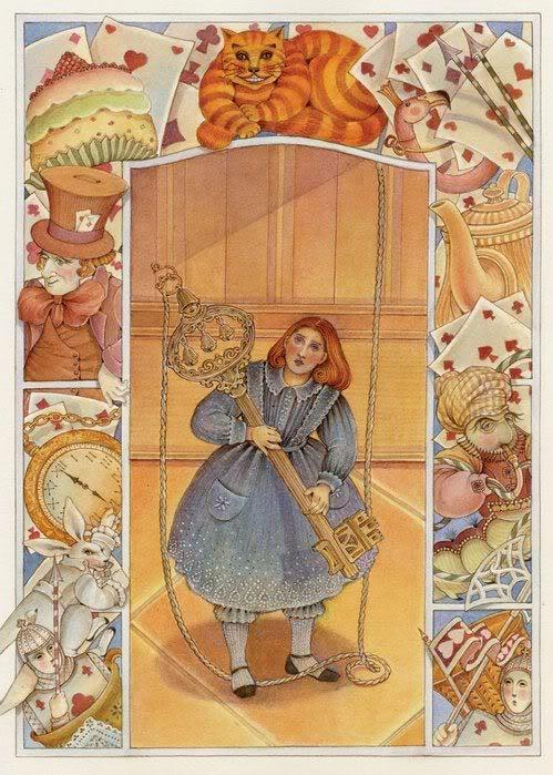
I also have to mention one Italian, though she’s illustrating a scene that never happens: Paola Fratalocchi Ventura shows Alice with her gigantic golden key, though it’s pretty obvious that this success will not to our heroine much good after all. Paola is a contemporary artist, but I had a hard time finding a website or a blog for her. I found news of an exhibition she did in 2018, just to give you a timeframe.
Shutting Up like a Telescope
The reverse scene comes when Alice finds a casket with a cake in it, and east it because at this point she doesn’t really care what happens and she really just wants to get into the garden.
One of my favourite illustrations is Yuri Vashchenko ‘s, who gives up a yellow-robed Alice stretching like a Modigliani.
To be honest, I have zero proof he’s illustrating that scene and not the one where Alice goes and look at the bottle first, which is most likely, but I frankly prefer not to think these are the actual proportions he chose for her. If you take a look at his other work, however, I’m most likely to be wrong, here: it’s surrealism at its best.
The same idea seems to have been taken up and reworked by British illustrator Michael Foreman for a 2004 edition by Chrysalis books. His illustration of Alice reaching up is not particularly interesting, but her distorted Alice growing up is really something else.
The idea of her neck being longer is usually adopted for the other scene where Alice grows up and gets mistaken by a snake, but more rarely here.
It’s worth remembering, however, that it’s Tenniel himself who firstly indulges in this idea of Alice shrinking up in a disproportionate matter, particularly when it comes to her neck.
Among the artist who choose to illustrate Alice while she grows back up again (and a little too much at that too), we have Justin Todd, which we have already encountered and who has a strikingly surrealistic touch. He often breaks the fourth dimension and brings on the page scenes from different moments.
This blog I already mentioned has a whole article on illustrations featuring size changes, and back in 2011 they dedicated an article to this particular illustrator.
Another artist who played a lot with time is Lidia Shulgina, a German painter, illustrator and sculptor, who illustrated Alice in 1979 as her diploma work (you can see it here) and then came back to it in 1981 (here) for a retelling by Boris Zakhoder.
She gives us different moments, with the rabbit coming and going, and Alice crying in the middle.
Erik Kincaid, also published on the Alice big and small blog, gives us the scene where Alice is eating the piece of cake. As the author of the blog points out, /This version of Alice is clearly inspired by Carroll’s photographs of the real Alice Liddell».
she tried her best to climb up one of the legs of the table,
but it was too slippery; and when she had tired herself out with trying,
the poor little thing sat down and cried.
At the beginning of the following chapter, “The Pool of Tears”, Kincaid also gives us a distorted Alice in her enlargement. Another illustration of Alice stabilizing her size can be seen, alongside other pictures, here.
A few studies have pointed out how Alice in Wonderland could contain hints of talk about eating disorders, something Carroll himself might have not been completely unaware of when it came to Victorian society. I particularly recommend you read this as a starter, if you want to explore the topic.
Rosemary Honeybourne gave us one illustration of Alice eating the cake, for her Canadian edition, published in 1969 by McClelland and Stewart. I really like them, because even if we have a smiling Alice (and that sometimes can get too sugary for my taste) she has her mouth curled in a mischievous way and you can tell she’s up to no good.
It reminds me a lot the mischievous and little Alice portrayed by Ada Bowley in 1921, with her golden curls and her dress with French lilies that might get her in trouble with the Queen of Hearts later on. Proportions are weird in this one, though: she’s the right size to squeeze through a door, a rather big door considering Carroll describes it like the size of a rat, and the dimension of the glass table doesn’t really add up as well.
Soon her eye fell on a little glass box that was lying under the table:
she opened it, and found in it a very small cake,
on which the words “EAT ME” were beautifully marked in currants.
The cake itself is not particularly often portrayed. If you want to take a look at one possible interpretation, you can check out this illustration by Jason S. Alexander for a 2001 edition by Dalmatian Press. You can see some more scans here, though the author kind of hates him. I suggest you check out particularly the one where Alice is little and is looking up at the top of the glass table, where the exaggerated perspective is, in my opinion, really beautiful.
Another comic artist to work on Alice was Skottie Young and now it’s my turn to deeply dislike someone. Some of the work he did on the X-man, back in the days, is probably the single graphical I loathed most as a youngster. I still get chills if I think about it.
Still, this sketch of Alice is nice, though I do not know where that came from and where that went, and there’s the distinct possibility that it went into this appalling thing.
Among even more contemporary artists, I have to mention Annie Henderson, who did a cool Alice illustration in 2011. I would love to see what happened with her Alice project, and encourage her to take it further. I love the framing in a playing card, the sadness in Alice’s eyes and pretty much everything else in this picture. You can see the original on DeviantArt here.
Another good one seems to be from the following year, by one Elena Bazanova who apparently did a notebook version of Alice in Wonderland. You can find it on sale here and this one is dated 2012, though I must say both the book and the illustrations look a little older. Again, you have to love the distortion, though I do not like smiling Alices. Other illustrations from the same artist can be seen here, on the Alicismo thumblr.







3 Comments
Shary
Posted at 16:50h, 04 OctoberI would love to see Tove Jansson’s (creator of the Moomintrolls) version, she did the drawings for a Swedish Alice edition in the 60’s??
Beautiful selection thank you!
shelidon
Posted at 11:55h, 06 OctoberI’m glad you liked the selection! From Tove, I’ve got something here, here, here which is the Caterpillar and my favourite of hers, here and here.
Anders Solli
Posted at 16:30h, 15 JulyFun fact Lewis Carroll devised the 1893 magic lantern slides so canonically he envisioned Alice as a brunette wearing dark blue.