
I’m currently in Venice for the Architecture Biennale, and I stopped at the local Fondazione Prada for the current exhibition by AMO/OMA, more out of due diligence than anything. I confess I wasn’t expecting much. I was wrong, and I recommend this show to anybody who’s interested in the visual storytelling of data, whether abstract or geographical.
The monumental work features over 300 diagrams, spanning from the XII century onwards – if you think telling stories of numbers through pictures is somehow a contemporary thing, think again – and it focuses on the arbitrary, perfectly on point selection of 9 themes deemed urgent by the studio:
- the Built Environment, showcasing architect’s efforts to deal with sustainability more than anything;
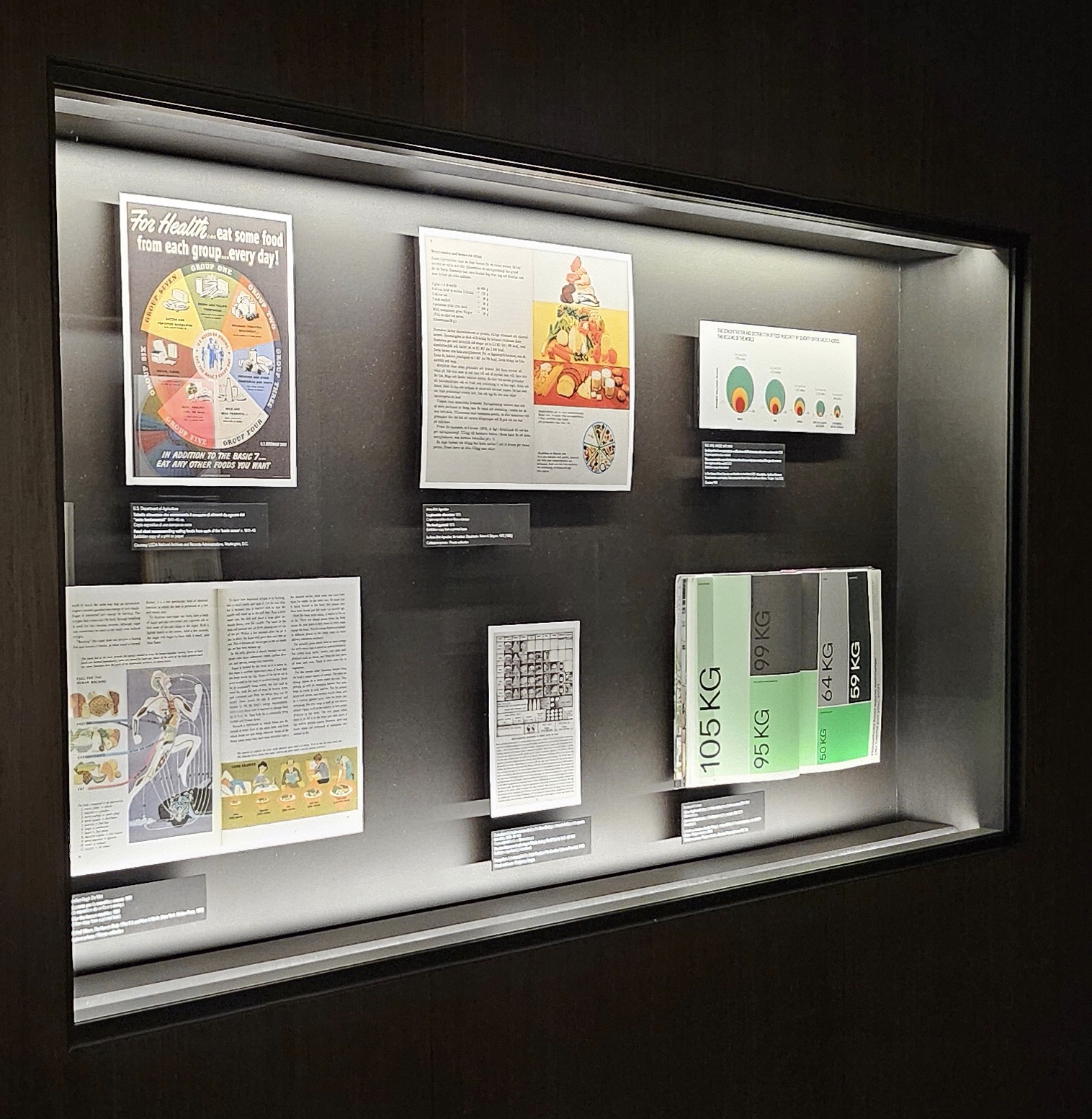
- Health, with a colorful selection of our effort to show and tell about the human body, some very ancient Arab texts getting the nervous system right, and infographics on how we’re managing to let our fellow humans die;
- Inequalities, a theme that’s theoretically central to the Triennale in Milan too, even if that one has a… somehow peculiar set of angles but I’ll write about it eventually;
- Migrations, a direct cause and consequence of the previous one, with some very interresting takes on both the contemporary and the previous centuries’ migrations, and the fundamental idea that migrations are natural and the only reason we’re still alive as a species;
- Environment, with winds and hurricanes and volcanos and our efforts to explain all of that;
- Resources, with direct ties to the previous theme and, unfortunately, an equally direct tie to the next one;
- War;
- Truth, starting from the general idea that we don’t have one, an idea clearly reflected by the peculiar and unique set up of the room;
- Value, possibly the main theme we associate with the visual display of data.
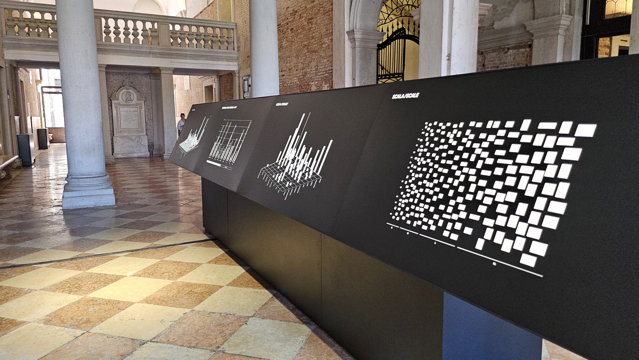
0. The entrance room
The ground floor of the splendid palace hosting the Venice headquarters of Fondazione Prada hosts the introduction to the exhibtion, with diagrams on the displayed diagrams because we’re nerds but people at AMA/OMA are nerdier. The diagrams focus on the geography if origin, the kind of exhibit (original vs. reproduction), on the media type and scale. A feast for the eyes. I leave the possible insights up to you, as diagrams are always neutral, aren’t they?
1. Upstairs: diagrams are never neutral
It’s kind of refreshing to see the same topics appearing over and over again, even though this might be a confirmation bias on my behalf. And yet, we spoke about it many times in the last months and it appears more relevant than ever, in the age of generalist Artificial Intelligences which appears to be spitting thruths and in the era of fake news. The show compares diagrams, and their apparent neutrality, with words and the tool we use to weaponise them: rethorics. To the curators, structure and proximity in diagrams are comparable to what emphasis and exposition do in a discourse made of words, and yet the result is the same: both diagrams and words are storytelling, a narration aiming to sway the listener – or viewer – towards a certain opinion, a certain aspect of the truth. OMA, who has always used diagrams heavily in their design expositon, presents this aspect with absolute transparency and a candor I did not expect. I admit this is the panel that made me fall in kive with the exhibition, right next to the entrance of the upper floor, in a room so crowded with frescos you don’t even pay attention to them.
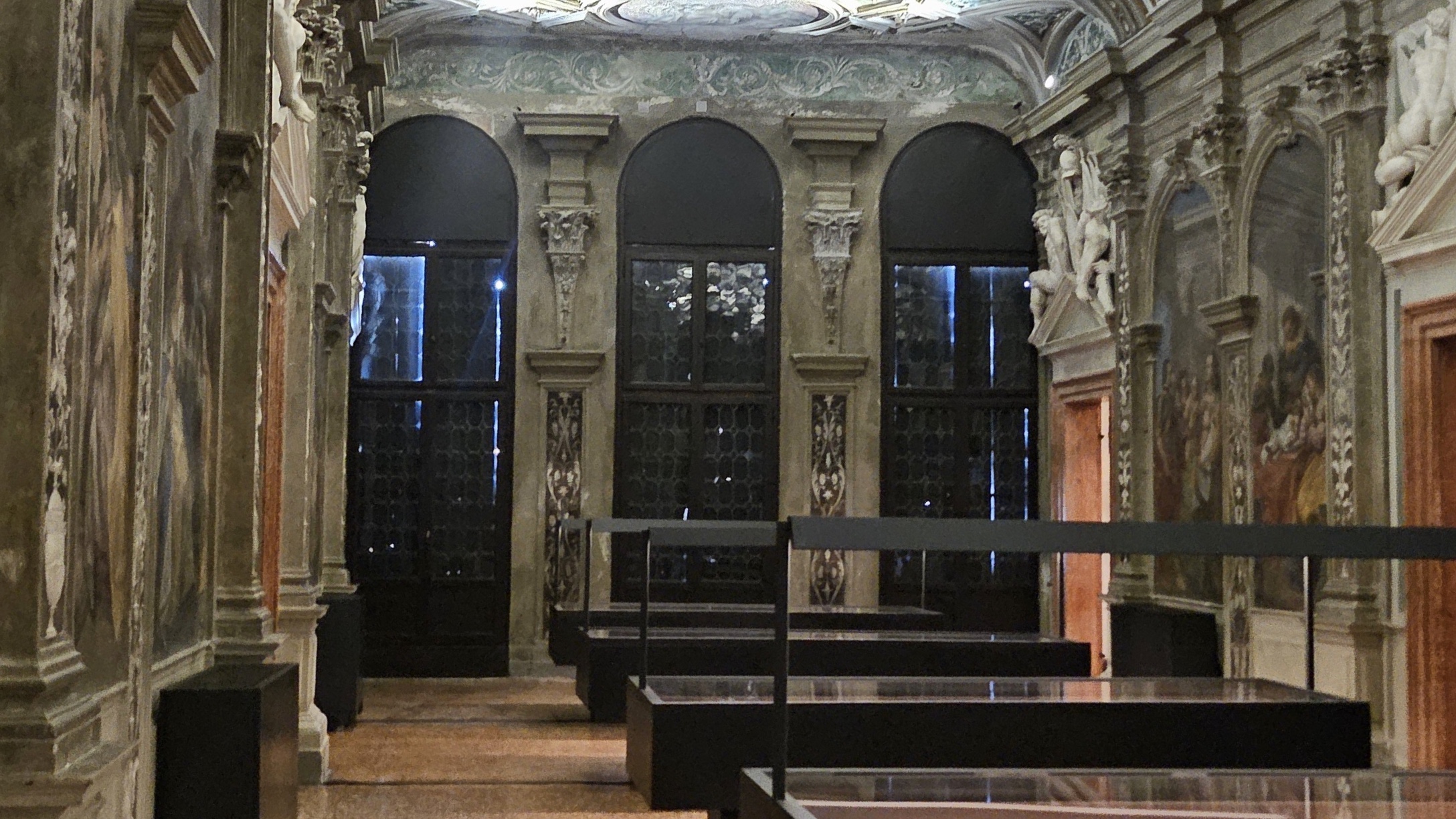
The main sector of the show is here, upstairs, weirdly organized between nine long tables in the central area – neatly lined up from 1 to 9 – and focus rooms scattered all over the place, based more on their size than their sequence. If you want to see the main table and then the corresponding focus room, I suggest you keep the map at hand: you can either take your own printed copy downstairs or be a good child and use your phone to fetch your digital copy from the QR code, or use the one I’m providing below. You’ll have some zigzagging to do.

1. The Built Environment
I’ll have to contradict myself and my previous statement, on this topic, as I found this room to be the most self-serving and least interesting focus on the nine. And since the focus is sustainability, the narrative being pushed here is that there’s a bunch of heroic archistars focusing on the theme starting from the XX century and for the first time in history. Don’t make me laugh. The interaction of buildings with natural elements such as air, light and sun was well known, before our own greed and onanistic approach to buildings caused the mess we’re currently trying to fix. Alas, as every student in architecture knows, everything that came before the XX century is to be considered quaint at best, irrelevant at most, if you want to be taken seriously. So here we are.
The focus room features some quaint schemes from the 1900s and 2000s, including a charming sketch by Wladimiro Acosta from 1943, but nothing more.

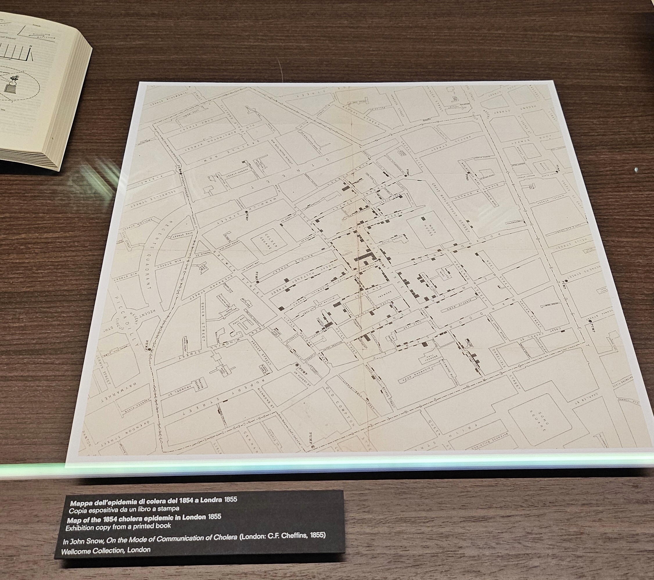
2. Health
Every single one of my students know you can’t study the importance of data visualisation without the aid of John Snow, and that’s John with an h, not the Game of Thrones dude. He was a surgeon who studied the diffusion of cholera in London during the 1854 epidemic, and he had the intuition of marking the number of deaths symbolically on a map. The knowledge and insight created was instantaneous: it became clear that deaths were pivoting around specific sources of public water, and sparing buildings which were relying on a different supply of water. The idea that water itself was spreading the diseas was considered ludicrous, back in the days. One of the first applications of what we’d call GIS a century later proved everybody wrong, and saved many lives.
The focus rooms abandons the geographic angle and concentrates on the different schematic depictions of the body, either as a machine or a symbolic entity, more governed by spiritual and supernatural forces. I think you know where I stand in this battle.
3. Inequalities
The topic is so ample it would need its own show. On, wait, there is one. In Milan. Curated by an archistar. And has a whole floor on bacteria. As I said, I’ll write about it another time. When I’ll have something better to drink.
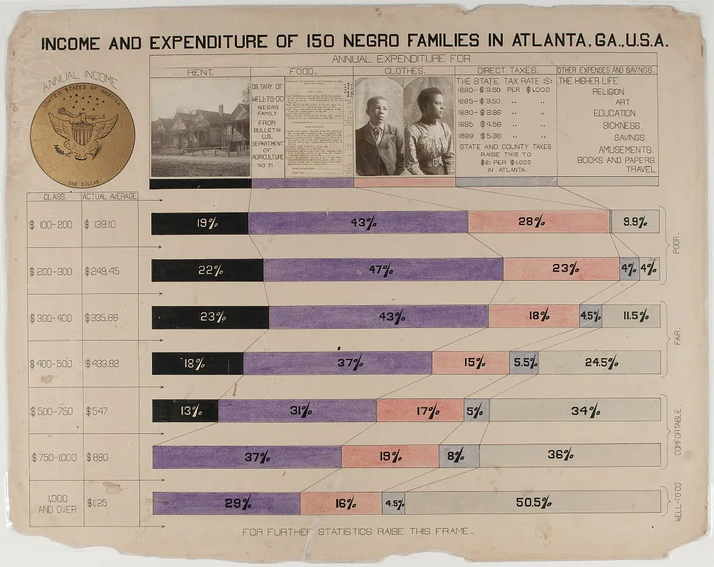
This show decides to skim the surface of the topic and then dive deep into a specific kind of inequality, narrated by the work of William E.B. Du Bois (1868 – 1963). If you don’t know him, the guy was an American sociologist who promoted and organised a show on African-Anericans for the 1900 Universal Exhibition in Paris. The original display was made up of 63 diagrams hand-drawn in the Department for Social Study of the Atlanta University in Georgia, and they were meant to see how far the African-American community had managed to achieve in such a short span of time – slavery had been abolished in 1865 through the so-called 13th amendment – and how much they could still achieve. Unfortunately, many of the displayed inequalities still stand today, and the concept of the exhibition still stands. Things didn’t move as fast as Du Bois was hoping, but since he co-founded the NAACP civil rights movement in 1909, I think he was very clear on that.
4. Migrations
As I anticipated in the introduction, the exhibition’s angle on the topic is supremely interesting: that migrations are more than natural, and instrumental to our survival as a species.
The focus room is dedicated to the work of Philippe Rekacewicz, a geographer, cartographer and information designer author, amongst others, of the masterpiece Palestine-Israël: une histoire visuelle. His section is very thin, alas too thin, at the back of the displays on theme 3, and still I encourage you to take a look and ponder, consider the story that’s being told, and never take antyhing for granted.

5. Environment
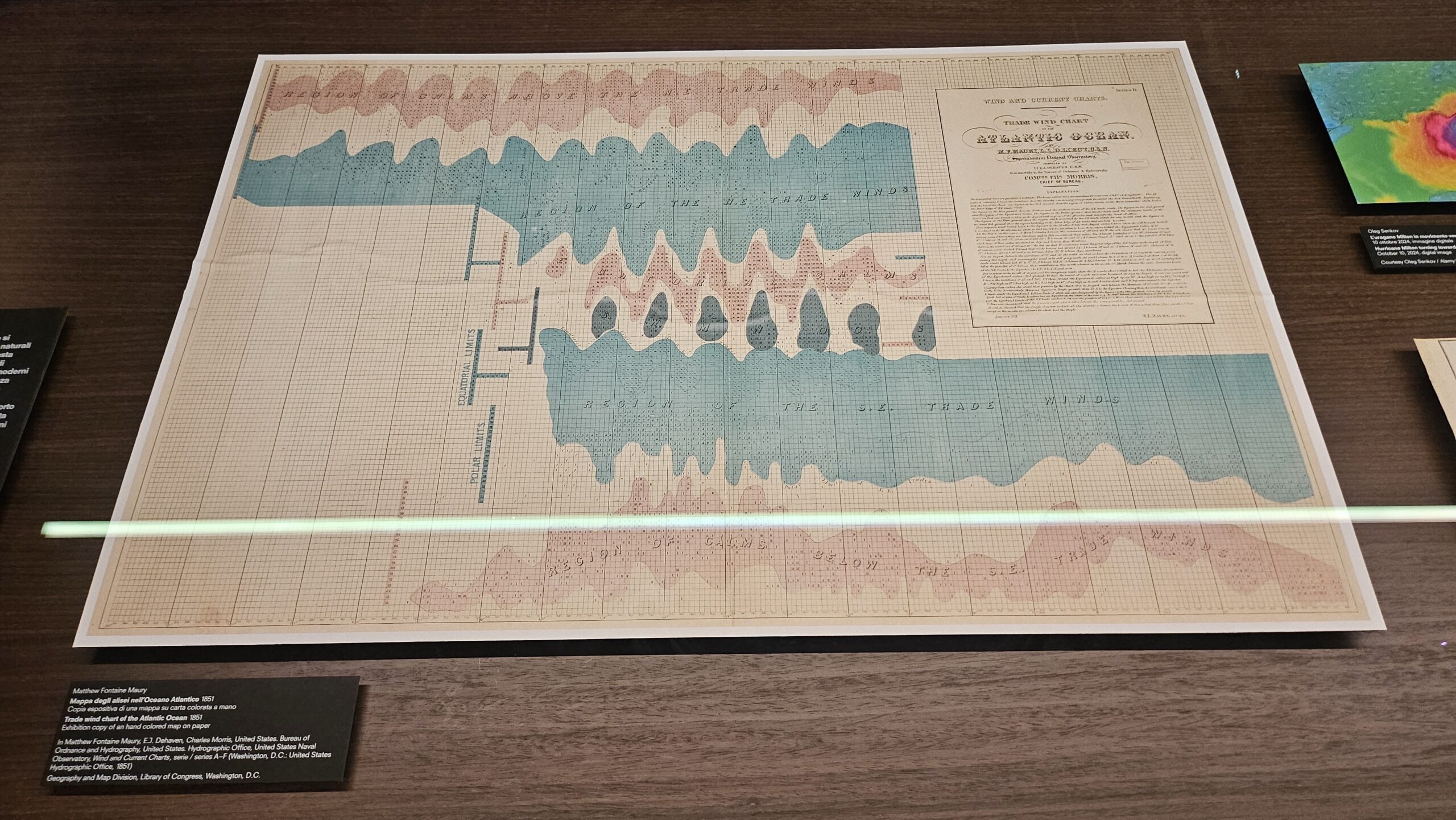
From climate change to disaster analysis (and prediction), the focus room for this section presents three different, intertwined themes: the world, elements and calamities, while the main table displays enchanting pieces such as Harold N. Fisk’s map of the Mississipi’s alluvional basin and Matthew Fontaine Maury’s map of the so-called “trade winds” (the alisei), winds so crucial in the Atlantic Ocean that I would like to read an alternate history fiction that explores how the world would be shaped without those winds, so disgracefully instrumental to the slave trade.
6. Resources
If the linear narrative of the exhibition didn’t hit you before – and I’ll admit the connection between 1 and 2, and the rest of the themes isn’t that strong – by now you’ll come to realise that you aren’t following a fragmented narrative but all pieces are part of a singular story: ours. Inequalities flows into the Enrivonmental section on its tiptoes, maybe, but strikes back with a vengeance when it comes to resources, through the powerful work of Charles-Joseph Minard and a focus on food.
Minard was a guy who was doing our job back in the 50s. The 1850s. He was surveying and representing charts on the movement of goods and people, in a style that would create our flux diagrams. Goods were starting to be treated as troops during a military campaign, as trade wars started to be a thing, and therefore demanded a similar way of being represented: from coal to wheat, which leads us to the second focus section on food, a graphical representation aids us in understanding how everything is connected in this global economy of inequalities we’re upholding.
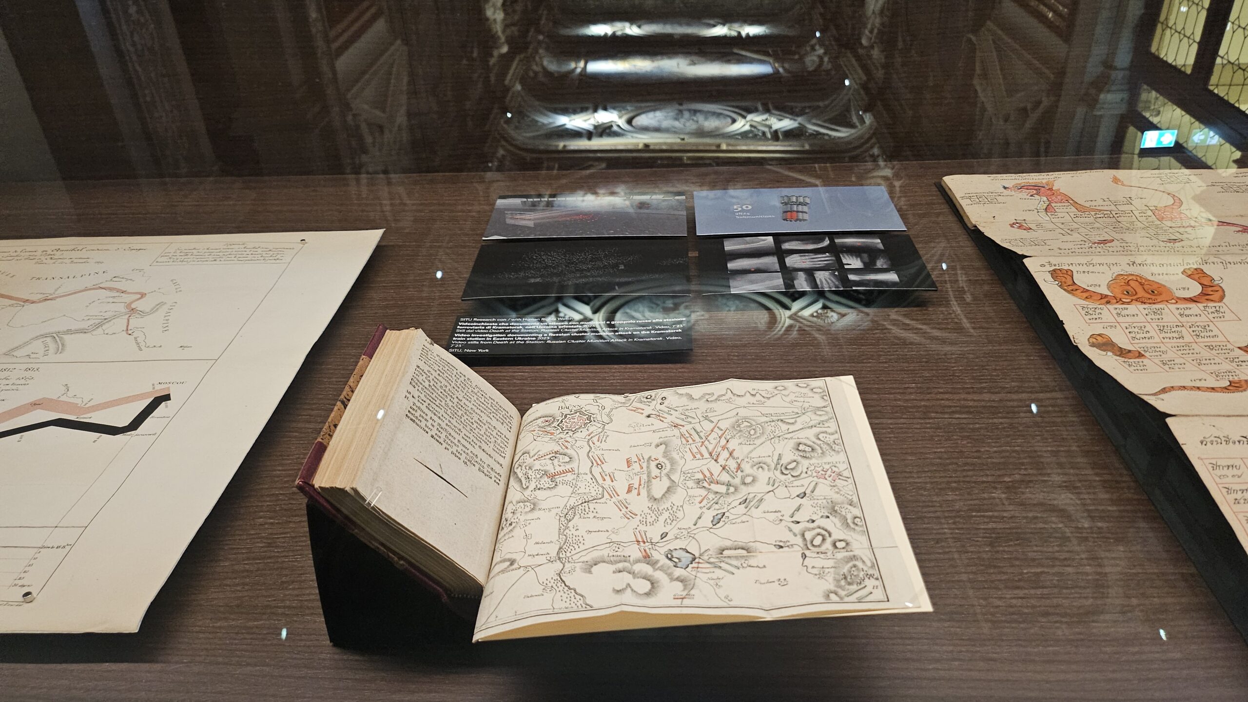
7. War
Naturally connected to plague and famine, as the Apocalypse tells us, strategies and the science behind recent and ancient wars have one thing in common: detachment. When you represent troops, and deaths, and people in general through the lens of a visual diagram, the operation becomes much more clear than it was when you were doing the same thing about migrations. The human side is completely lost on us, through the seemingly aseptic lens of the visual representation.
This room is probably the most complex one, tucked away in a corner of the building you can only reach through another room, and features monitors with visual aids for drone strikes, in which the abstraction of the human life couldn’t be more obvious. The narrative is paired with diagrams on the atomic bomb, least we forget where we’re headed.
8. Truth
War is connected to the concept of truth through a double tie, and that’s why I approve so much that this is the sibsequent section, instead of the previous one. Even if they’ll try to teach you otherwise, many wars and human acts of violence didn’t span from ideology, but came from economy, from the crusades to the Ukraine invasion, down to the holocaust. Then the narrative steps in. The distortion of truth in favour of a less crude perspective.
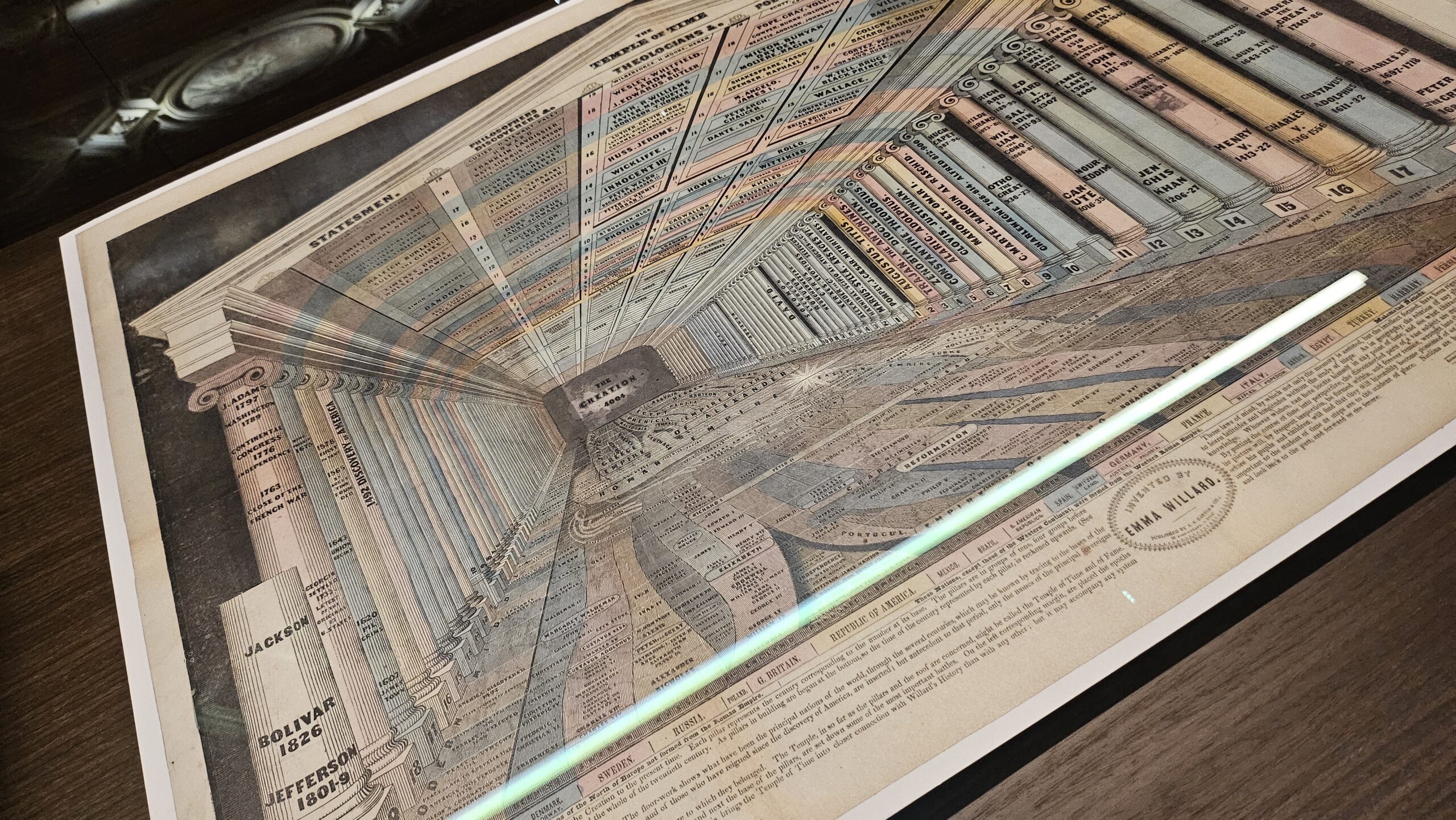
The focus room is divided into three topics: religion, astronomy, and history. Each of them shows our strife to try and tell the truth through pictures, numbers, and the manipulation of both.
9. Worth
As the focus of many of our analysis, it feels natural for money to close the exhibition and then yet its section feels like due diligence. I felt the curators were trying to tell us that, eventually, it all comes down to people and resources, and how they both interact with the built and natural environment. Least we do woth money the same thing we do with war: hide people behind figures. People who live, thrive, strive, and die.


No Comments