
Così, giusto per la gioia dell’anonimo con un gusto pessimo.
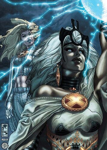
Anche voi preferite la versione in bianco e nero o sono solo io?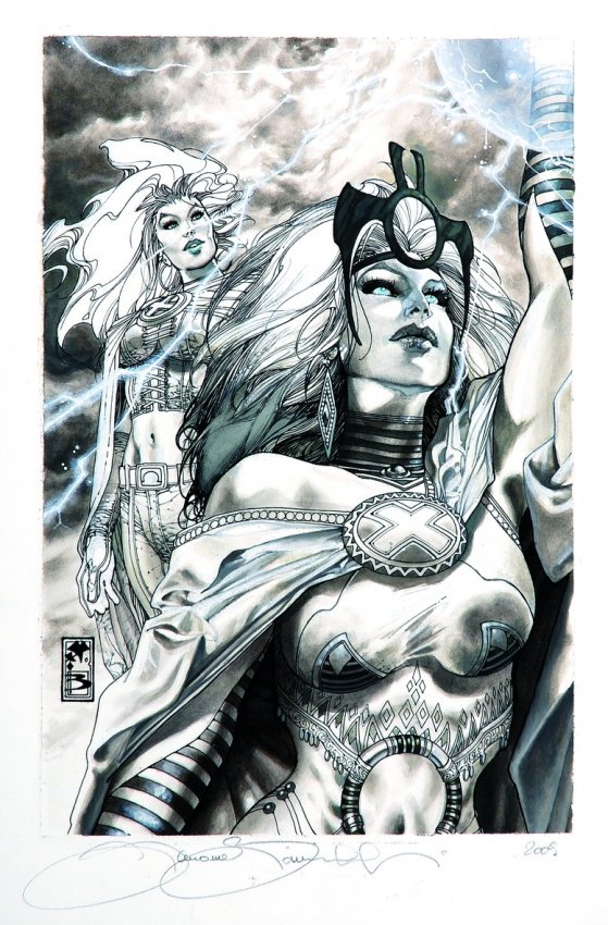
Anche voi preferite la versione in bianco e nero o sono solo io?

“The Immortal Hand” is a supernatural short story written by pulp author Arlton Eadie (the pseudonym of Leopold Leonard Eady). It was originally published on March 1929 in Weird Tales and features interior artwork by the prominent pulp illustrator C.C. Senf. “With a calm and
Continues from yesterday… CHAPTER II. Before the autumn was at an end, and while the brown leaves still stood thick on the beeches in our park, my brother and Bertha were engaged to each other, and it was understood that their marriage was to take place

On outsourcing to AI agents without losing more than you gain Last week, I promised a colleague that, by the end of an article, she’d understand what everyone means when they say they “connected an AI agent to Revit via MCP”. I also promised she’d
“The Immortal Hand” is a supernatural short story written by pulp author Arlton Eadie (the pseudonym of Leopold Leonard Eady). It was originally published on March 1929 in Weird Tales and features interior artwork by the prominent pulp illustrator C.C. Senf. “With a calm and
Continues from yesterday… CHAPTER II. Before the autumn was at an end, and while the brown leaves still stood thick on the beeches in our park, my brother and Bertha were engaged to each other, and it was understood that their marriage was to take place

On outsourcing to AI agents without losing more than you gain Last week, I promised a colleague that, by the end of an article, she’d understand what everyone means when they say they “connected an AI agent to Revit via MCP”. I also promised she’d
8 Comments
HowlingWolf
Posted at 11:22h, 18 MarchCredo anch’io che, avendo a disposizione la tavola in grande formato, preferirei il b/n.
Nel piccolo, il colore aiuta a definire le figure.
Shelidon
Posted at 11:46h, 18 MarchPer essere in bianco e nero, comunque, è piuttosto definita: se le trovo, ti posto altre due copertine (ne ho in mente una di Greg Land e una di Cassaday) in cui veramente in bianco e nero non si capisce una mazz… ehm… non si capisce niente. In questo senso, l’uso delle ombre di Bianchi aiuta davvero.
HowlingWolf
Posted at 15:18h, 18 MarchPienamente d’accordo, anzi, ha un tratto splendido… il fatto è che nel piccolo il colore aiuta…
Damiani
Posted at 19:44h, 18 MarchB&W of course!
Shelidon
Posted at 12:49h, 20 MarchDa te non avevo dubbi, mio caro.
heraclitus
Posted at 08:35h, 21 Marchassolutamente meglio il b/n.
Lothwen
Posted at 11:44h, 21 MarchLi hai fatti tu?
cmq non sapri quale è meglio mi piacciono molto tutti e due
Shelidon
Posted at 13:17h, 21 MarchNo no no, ci mancherebbe altro, magari! E’ roba di un professionista attualmente piuttosto quotato.