
Così, giusto per la gioia dell’anonimo con un gusto pessimo.
Anche voi preferite la versione in bianco e nero o sono solo io?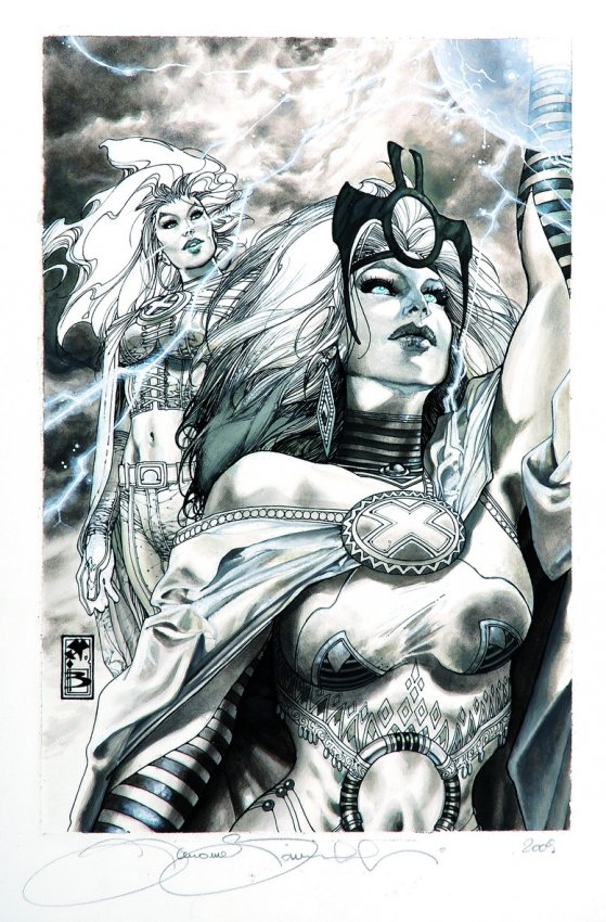
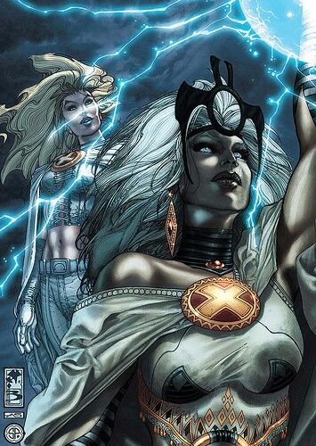
Anche voi preferite la versione in bianco e nero o sono solo io?
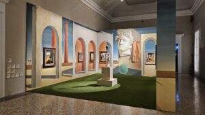
What a splendid exhibition! I was expecting your regular, run-of-the-mill show at Palazzo Reale, which is usually good enough, but I was surprised at the depth and width of this new endeavour, that spans across the city with multiple initiatives and, even within the show
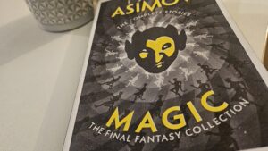
I take issue with this volume, and not because they’re short stories and you’re bound to like some more than the others: they’re all delightful, with very few and negligible exceptions. No, my problem is curatorial: I take issue that instead of grouping all the

Cara Trenitalia, Quando ero ragazza, ogni tanto mi capitava di prendere il treno da Milano a Tirano, per raggiungere i miei genitori in vacanza sul lago. È un viaggio verso nord, attraverso la Brianza Felix, che molto presto trasforma la campagna in una collina boscosa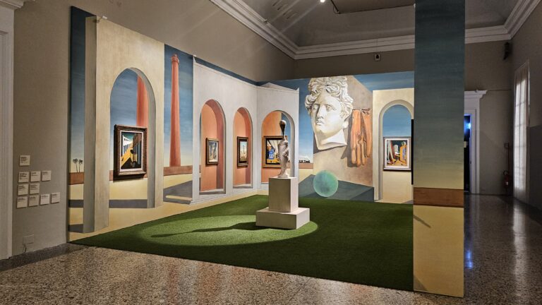
8 Comments
HowlingWolf
Posted at 11:22h, 18 MarchCredo anch’io che, avendo a disposizione la tavola in grande formato, preferirei il b/n.
Nel piccolo, il colore aiuta a definire le figure.
Shelidon
Posted at 11:46h, 18 MarchPer essere in bianco e nero, comunque, è piuttosto definita: se le trovo, ti posto altre due copertine (ne ho in mente una di Greg Land e una di Cassaday) in cui veramente in bianco e nero non si capisce una mazz… ehm… non si capisce niente. In questo senso, l’uso delle ombre di Bianchi aiuta davvero.
HowlingWolf
Posted at 15:18h, 18 MarchPienamente d’accordo, anzi, ha un tratto splendido… il fatto è che nel piccolo il colore aiuta…
Damiani
Posted at 19:44h, 18 MarchB&W of course!
Shelidon
Posted at 12:49h, 20 MarchDa te non avevo dubbi, mio caro.
heraclitus
Posted at 08:35h, 21 Marchassolutamente meglio il b/n.
Lothwen
Posted at 11:44h, 21 MarchLi hai fatti tu?
cmq non sapri quale è meglio mi piacciono molto tutti e due
Shelidon
Posted at 13:17h, 21 MarchNo no no, ci mancherebbe altro, magari! E’ roba di un professionista attualmente piuttosto quotato.