
There’s a particular tension I carry with me when I walk into exhibitions like Art Decò: il trionfo della modernità. My heart irreversibly shuns away from some of the ideological implications of the movement – and I’m certainly more partial to liberty – and yet, I can’t help but feel the magnetic pull of Art Deco: its geometries, its luminous rigour, the theatrical elegance that seduced an entire generation. So I approach this show with a dual gaze: captivated by the visual power of a movement I love, yet consciously distanced from the ideological distortions that accompanied its history. This exhibition, hosted within the solemn halls of Palazzo Reale, lays bare the paradoxes of modernity, revealing how the search for beauty, order, and progress was often shadowed by nationalism and authoritarian seduction. It’s a journey through an era that shaped our aesthetics and challenged our ethics. And it couldn’t be more relevant than today.
Let’s see what it’s about.
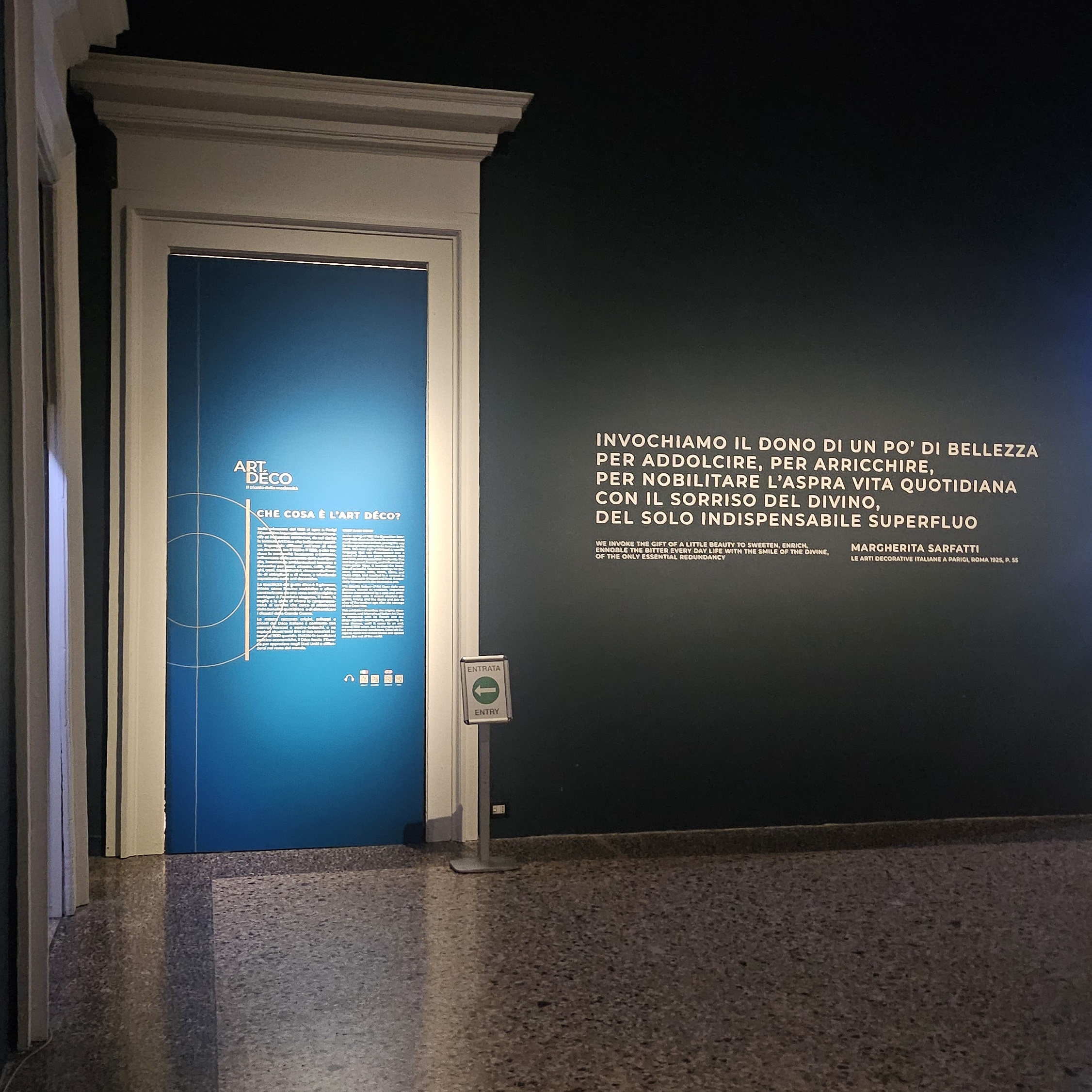
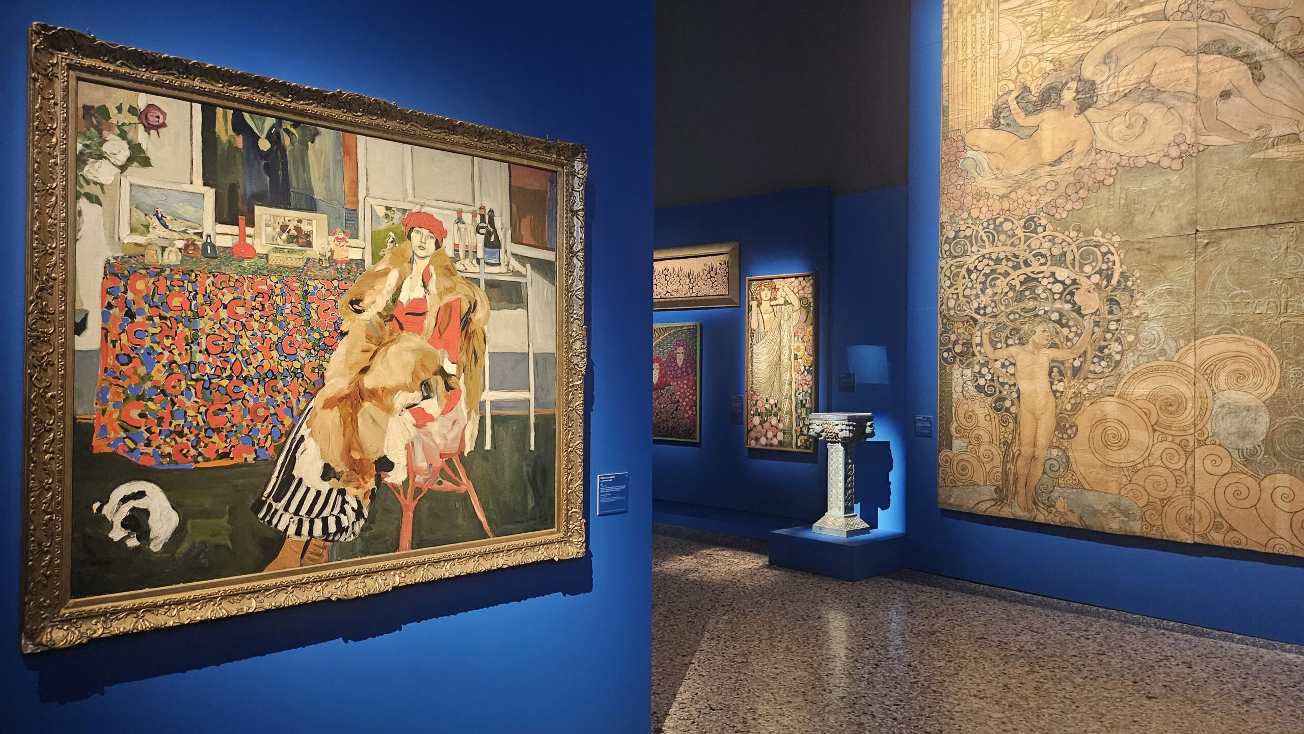
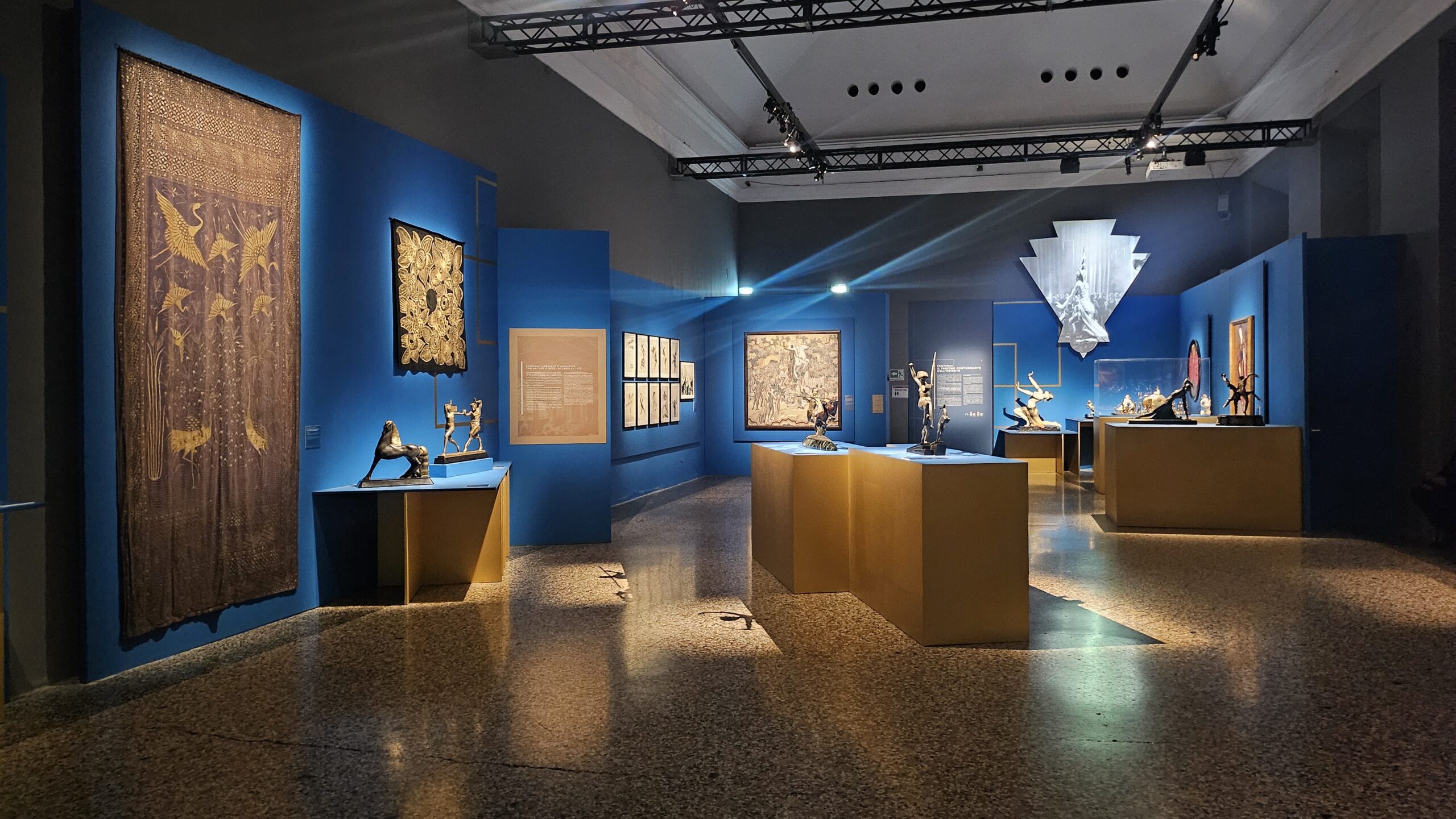
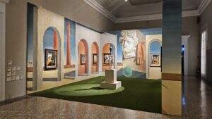
The entrance to the exhibition makes its intentions clear right away: “curtain rises,” and you’re stepping in blue. Knowing personally the guy who calculated all the blue painted surfaces you see in this exhibition, I can assure you this was quite an effort. A neat white doorframe pops against a deep blue wall – part classic Milanese elegance, part Art Deco cinema vibes – and you half-expect someone in silk gloves to hand you a cocktail. Sadly, this won’t happen.
On the left, a panel gently “What’s Art Déco?”, as if we didn’t all secretly associate it with flapper dresses, geometries, and Great Gatsby décor. But fair enough. Meanwhile, on the right, Margherita Sarfatti delivers a quote with all the flourish you’d expect:
«Invochiamo il dono di un po’ di bellezza…»
— translation: let us invoke a little beauty, because life is rough and we need the kind of divine smile that only the strictly unnecessary can provide. A motto, frankly, I can get behind (minus the whole proto-fascist undertone, but more on that later).
The terrazzo floor of Palazzo Reale glistens perfectly like it’s auditioning for a role in a 1930s lobby. And with the lighting just right and the air thick with curated intent, it’s hard not to smile. You’re entering the land of streamlined opulence where everything is stylised, ideological, and just a little too fabulous for its own good.
Ok, but what is Art Deco?
If Art Nouveau was your eccentric aunt who wore flowing dresses and read Rilke in the garden — that’s me, I’m the eccentric aunt — Art Déco is your impeccably dressed godparent who smokes with a long cigarette holder and has an opinion on absolutely everything.
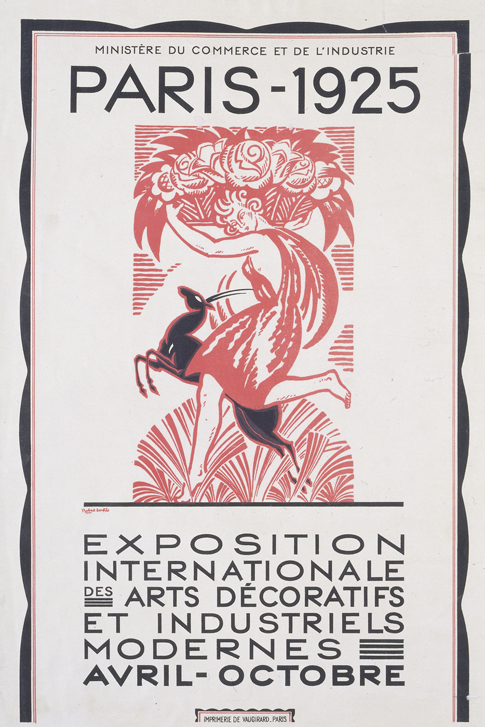
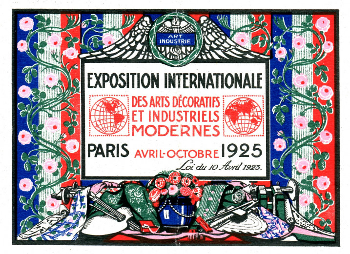
So, what is Art Déco, really? Well, it all began in Paris in the spring of 1925. The Exposition internationale des arts décoratifs et industriels modernes opened its doors and basically said: “Enough curves and lilies—let’s talk sleek lines, chrome finishes, and luxury that means business.”
A Language of Luxury
Art Déco isn’t just a style: it’s a full-blown aesthetic manifesto wrapped in lacquered wood and striped silk. Between 1920 and 1930, it spread like a very elegant wildfire across Europe and beyond, reinterpreting modernity with the tools of glamour, geometry, and unapologetic fabulousness.
This was the era of optimism, of forward motion, of Let’s never mention the trenches again. Art Déco served as an antidote to the gloom of the Great War and the Spanish Flu, and its signature blend of exotic influences, classical references, and industrial materials made everything—hotels, cafés, department stores—feel like the set of a Jean Cocteau film.
Glamour With a Grid
At the heart of Déco is glamour, yes, but also control. Symmetry, rhythm, repetition—like a Charleston with architectural ambitions. It was all about living well and being seen doing so: polished surfaces, stylized ornament, and interiors that whispered je ne suis pas un poveraccio.
It dressed the modern world for the ball, even as it marched it toward mass production.
And in Italy?
Ah, yes. Italy did what Italy always does: it created its own personal blend. Italian Déco mingled with Novecento and Rationalism, stole some geometry from the Germans — and not just the geometries, unfortunately — borrowed a column or two from the Romans for good measure. The result? A uniquely hybrid style that made banks look like temples and cafés feel like film sets.
By the 1930s, Déco was everywhere: from train stations to cinemas, from skyscrapers to sugar boxes. It eventually packed its trunks, crossed the Atlantic, and began conquering the world one stylised zigzag at a time.
So now you know: Art Déco is that charismatic character at the party who tells great stories, always overdresses, and leaves before dessert. Up next, we’ll start exploring how this visual language played out in Milan, where modernity strutted in high heels and everyone was just a bit too fond of stone.
Shall we?
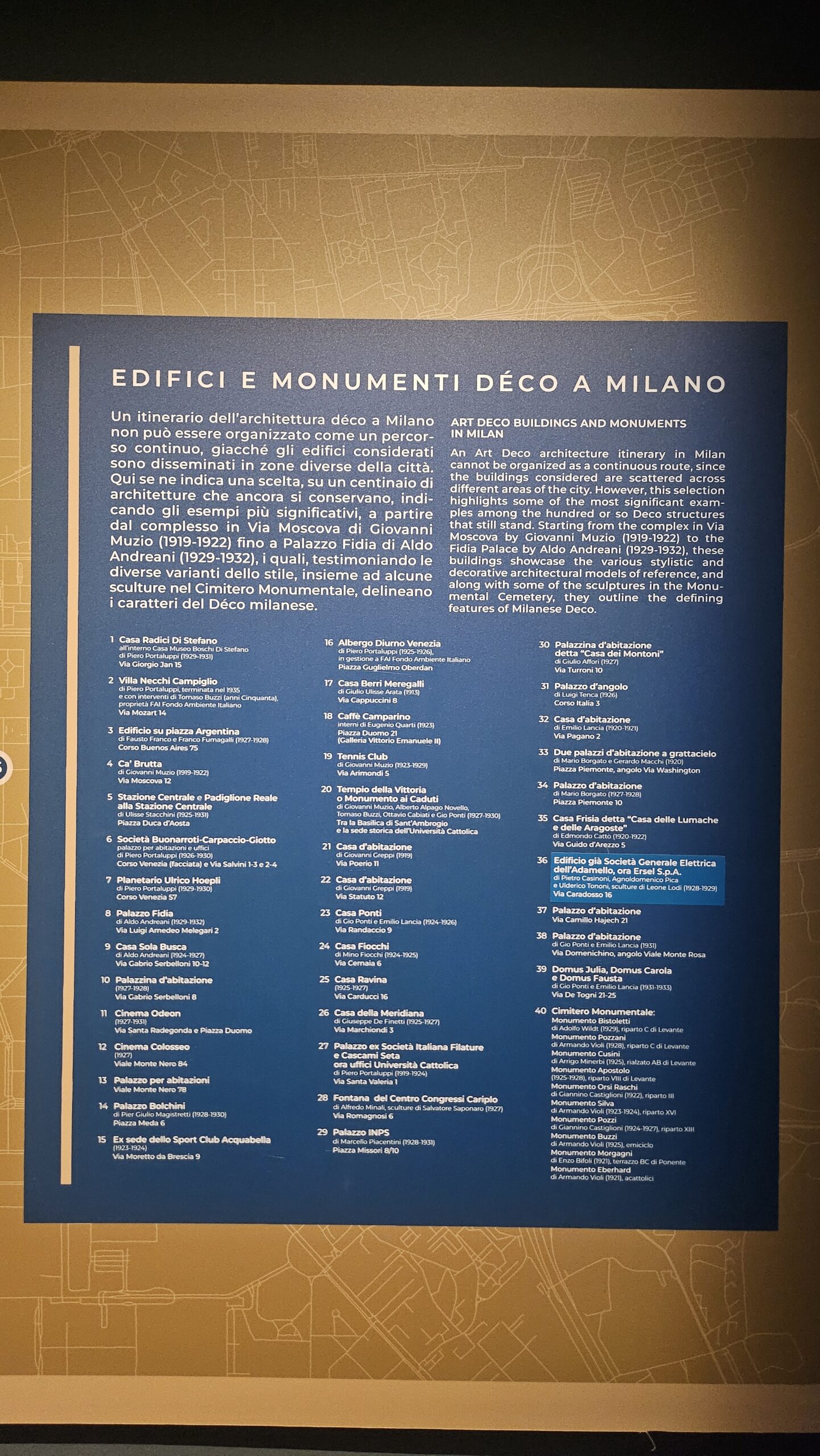
1. Art Deco in Milan: an exhibition rooted in the territory
You know you’re in Milan when even the exhibition wall labels double as urban planning manifestos. Right at the beginning of Il trionfo della modernità, you’re hit with a deep blue panel that promises a full Art Déco architectural map of the city. And what a list it is: 40 stops, meticulously numbered, democratically distributed, and unapologetically Milanese.
Let’s start with the obvious: this list is not for the faint-hearted. It’s a sprawling love letter to buildings that shimmer with stepped profiles, geometric flourishes, and the kind of decorative restraint that wants to look modern so desperately it won’t end well.
The curators say they couldn’t do an itinerary: the stops are too spread out. And since you liked so much my Casoratian walk through Milan, I just might take them up on their challenge.
The Full Art Déco Milan List
2. Up, Up and (Fashionably) Aloft: When Modernity Floated on Helium
Let’s be honest: nothing screams “modernity” quite like a giant floating sausage in the sky. Welcome to the airship room, where the zeppelin is not just a mode of transport: it’s an aesthetic statement, a cultural mood, and an unlikely fashion icon of the interwar years.
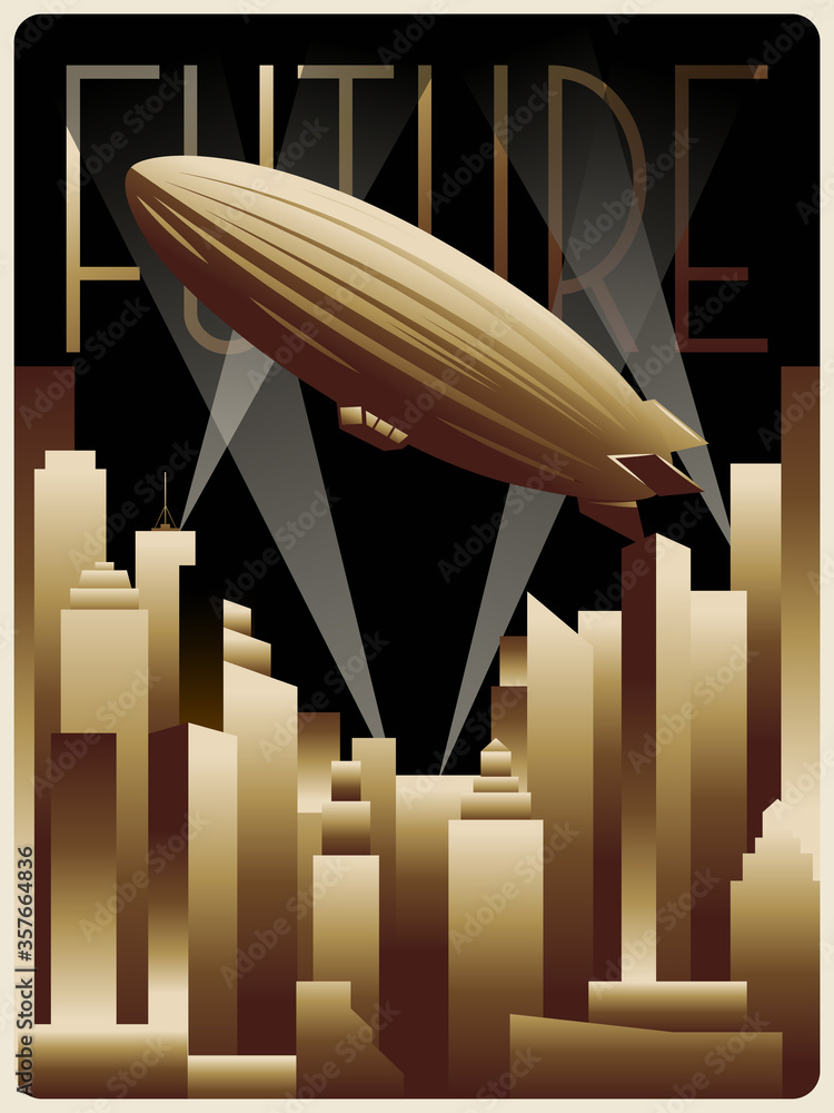
Meet the Dirigible
Generation D (that’s D for Déco, not Drama, though both apply) grew up surrounded by loss and longing, sandwiched between two World Wars, and developed an irrepressible hunger for life, style, and speed. And what better way to express this forward-facing optimism than by boarding an airborne floating lounge?
While Europe was rebuilding, modernising, and elbowing its way into a streamlined future, the dirigible – bulky yet elegant – emerged as the unofficial mascot of progress. War had cast it in a military role, but the 1920s and ’30s rebranded the airship for civilian pleasure and social prestige. Forget economy class: this was luxury travel for the elite, complete with velvet seats, champagne toasts, and hopefully a lot of monocles.

Dirigibles: The Deco Generation’s Flying Status Symbol
Stripped of its wartime connotations, the dirigible soared into European skies as a new-age chariot. It stood for everything the postwar world dreamed of: confidence in technology, trust in human ingenuity, and the conviction that the future was buoyant and full of promise (and preferably had dinner service onboard).
Crossing the Atlantic? No problem. Just climb aboard the Graf Zeppelin, lean back with a cocktail, and float from continent to continent like a god of the air. Until, of course, March 6, 1937. The Hindenburg tragedy brought this glittering dream crashing down, both literally and metaphorically. Spoiler alert: hydrogen and fire do not mix.

Floating Utopia, Grounded Reality
Still, before things came crashing down, the airship was more than transport: it was a stage set for modern life. It symbolised upward mobility (in every sense), technological confidence, and the belief that we could rise above the past, buoyed by design, steel, and gas. It was, in essence, the Art Déco spirit in cruise mode.
So here we are, in a room that reminds us how the aesthetics of optimism can be just as weightless – and as combustible – as helium. But oh, what a ride it must’ve been.
3. Before It Was Déco: Fauves, Klimt, and a Dash of Barbaric Chic
Before Art Déco arrived in its full sequinned glory, it went through a bit of a teenage phase. You know the type: emotionally intense, a bit dramatic, obsessed with bold colours and Viennese patterns, but already hinting at the glam adult it was destined to become.
Welcome to the 1910s, where the first stirrings of what would become Déco were gently bubbling under the surface of painting and sculpture, like a proto-jazz Age stew simmering with Fauvist fire, Klimtian shimmer, and a bit of barbarian flair.
Fauves and Flatness: The Anti-Naturalists Strike Back
Artists began sensing a shift in taste driven by two key forces: the neon dreamcoat of the Fauves and the brooding brushwork of the Expressionists. The result? A sort of willful two-dimensionality.
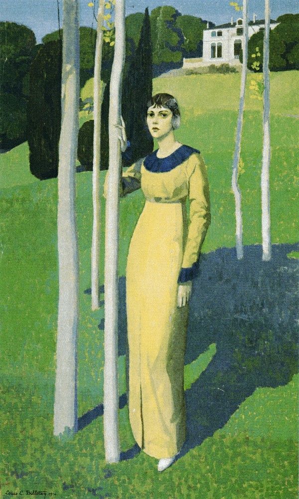
Case in point: compare La piccola russa by Mario Cavaglieri (1913) with Marie Rose Guérin in front of the Moulinet by Louis-Léon Billotey (1914). Both works flirt with the ornamental, stepping away from realism and diving headfirst into drama meets pattern.
Klimt’s Long Shadow
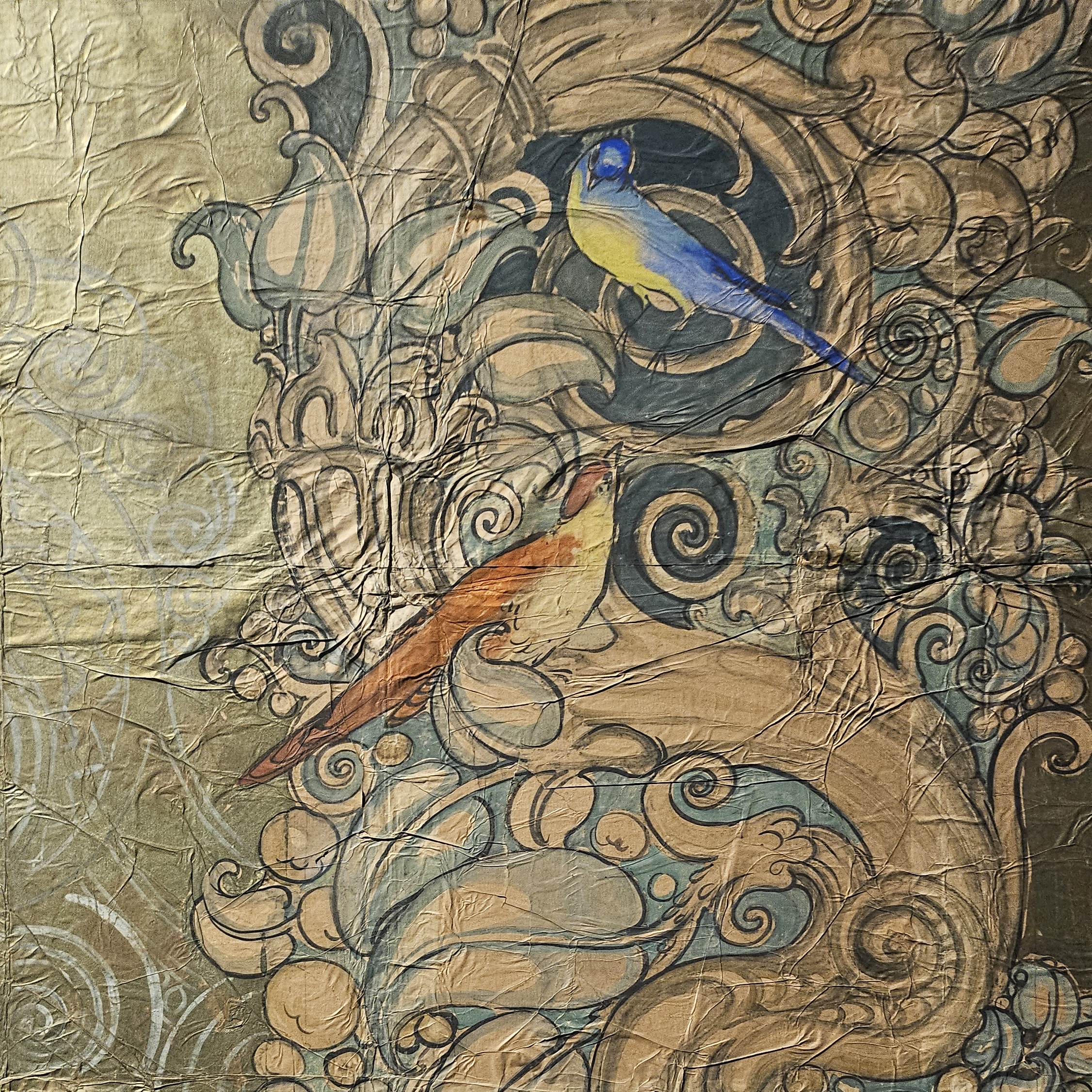
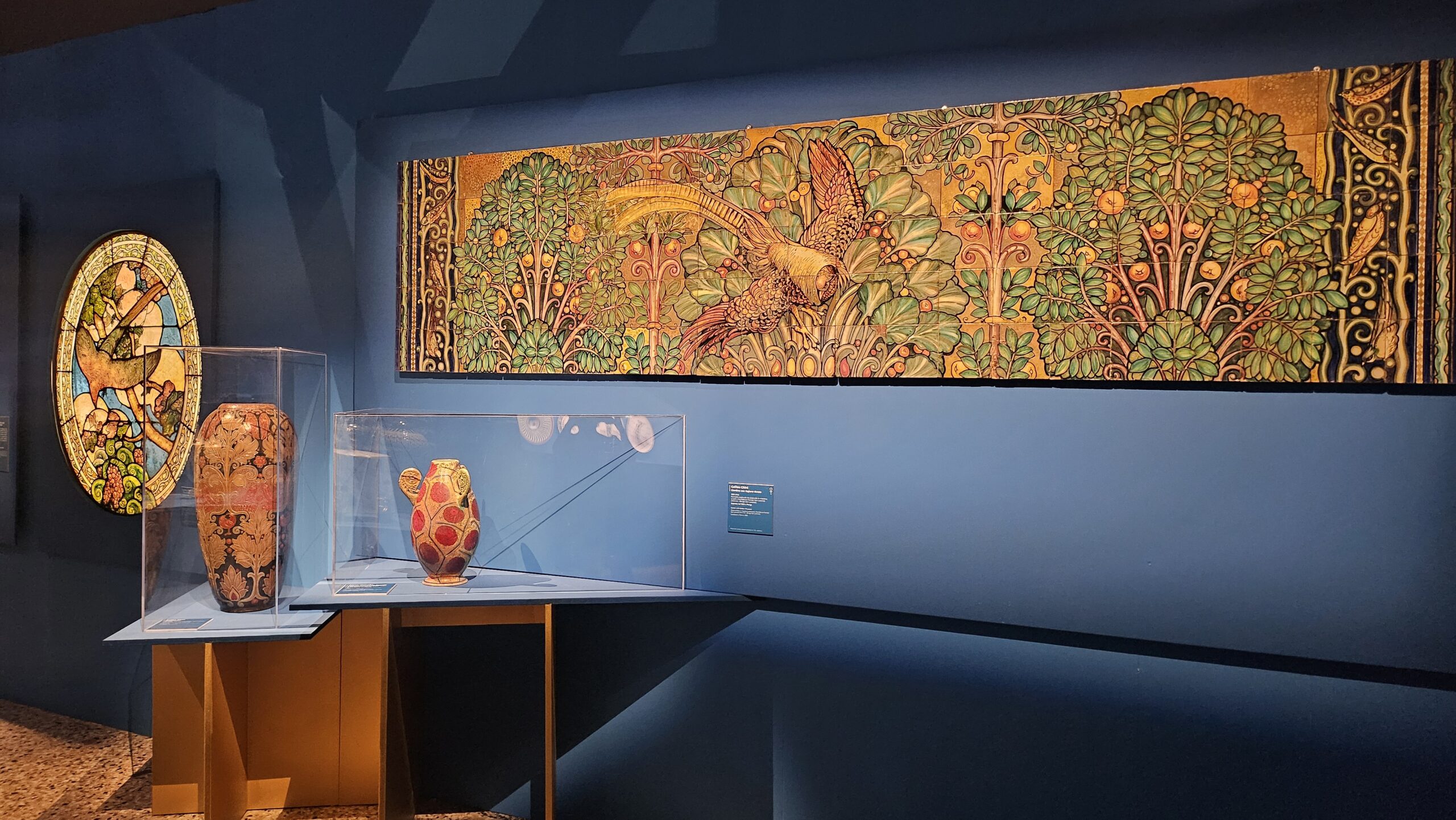
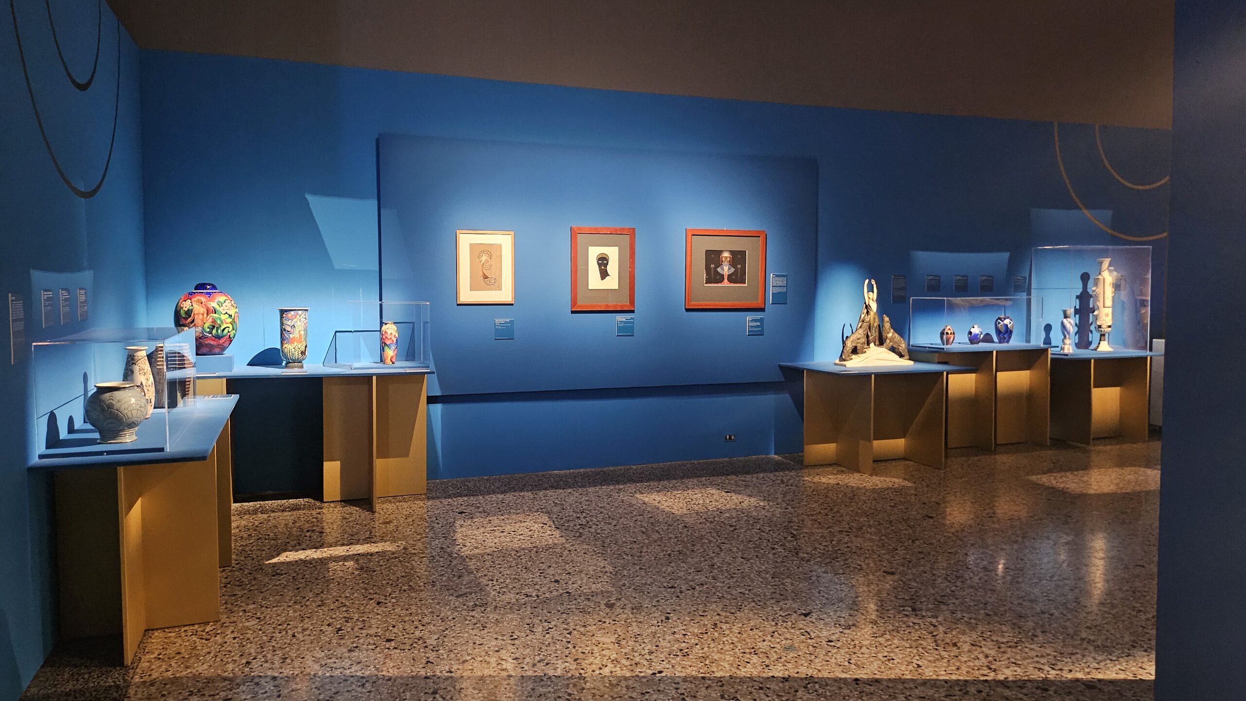
Then there’s the unmistakable influence of Gustav Klimt, which echoes everywhere like an expensive perfume at a gallery opening. We find it particularly thick in Galileo Chini’s massive decorative cycle for the Terme Berzieri spa in Salsomaggiore (1919–1922), where the walls practically melt in shimmering tendrils of ornament and allegory. Add Vittorio Zecchin’s tapestries to the mix, and you’ve got an early Italian Art Déco cocktail: one part Secession, one part silk, stirred not shaken.
Sculptors Get in on the Fun
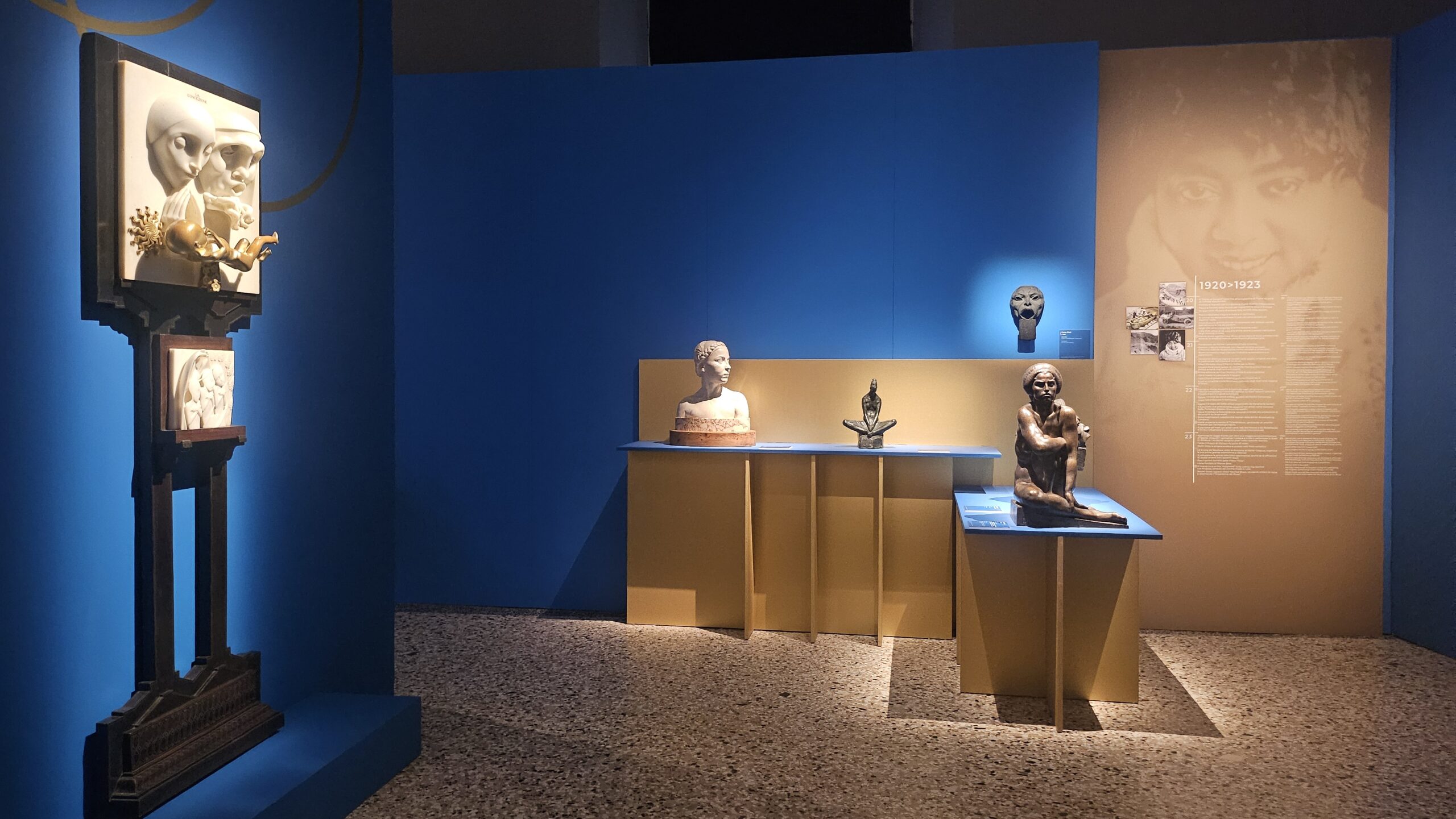
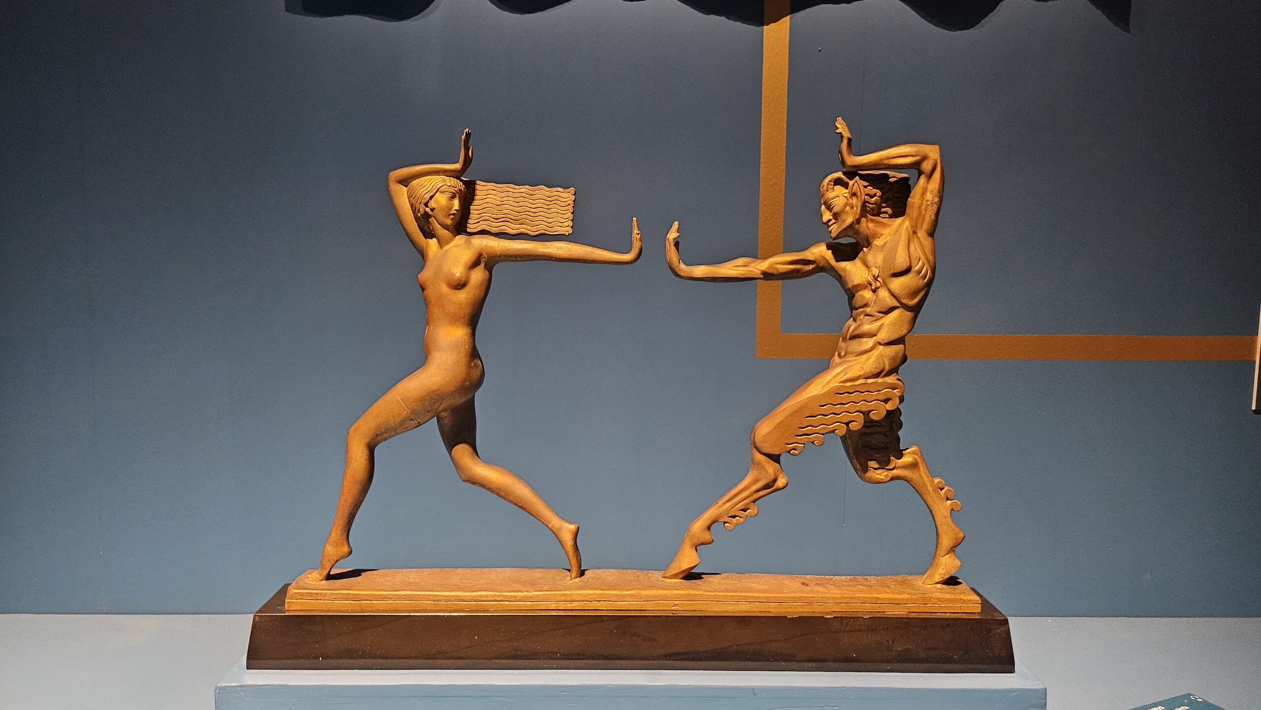
Let’s not forget sculpture, which, in true Italian style, couldn’t be left out of a style party. Enter Adolfo Wildt, whose La Concezione e i pargoli cristiani (1919–1921) brings the full force of marble melodrama. His chiselled anguish became the go-to look for bronze sculptor Carlo Pizzi, because what says modernity like kids in existential turmoil?

Meanwhile, across the Alps, Ivan Meštrović was doing his own thing, summoning what the panel calls a “barbaric” spirit with works like Vergine vestale (1915–17). It’s all very moody, very muscular, and just a little bit terrifying. These influences sneak into pieces like Attilio Selva’s Giovane Sabina (1922) and Enigma (1919), where mystery and symmetry shake hands in marble.
In short, Art Déco didn’t just drop from the sky with jazz hands and stepped façades. It brewed slowly, gathering color from the Fauves, patterns from the Secession, theatricality from Klimt, and a dash of Slavic sculpture that looked like it bench-pressed mythology.
Now it’s time to watch the movement step into its full cinematic stride.
4. Paris 1925: The World’s Most Stylish Branding Exercise
By now, Art Déco had been flirting, experimenting, and trying out outfits. But it wasn’t until Paris, April 1925 that it finally had its debutante moment complete with velvet curtains, industrial accents, and more decorative panels than you could shake a lacquered stick at.
As we have seen, the Exposition internationale des arts décoratifs et industriels modernes (yes, the title is long enough to deserve its own runway) was more than an exhibition: it was the first design week. Think of it as the red carpet event where various national styles strutted their stuff, and France — never one to miss a branding opportunity — stepped up to crown its Art Déco.
Who’s In, Who’s Out
As with all exclusive soirées, some guests were notably absent. Germany, fresh off its WWI defeat and nursing a bad mood, didn’t get an invite. And the U.S., perhaps out of principle or jetlag, stayed home too. But the rest of Europe was there, and they brought their finest:
- Italy, perhaps too ambitious for its own good and certainly eager to be seen, presented an incredibly varied lineup that managed to show off both its elegance and its muscle;
- France used the event to solidify its international aesthetic authority to show how modernity could be both industrial and tres chic;
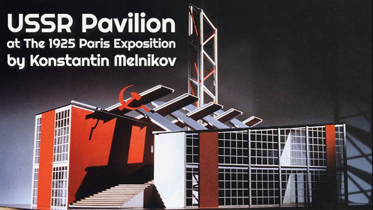
- the Soviet Union, never one to blend in, turned heads with Konstantin Melnikov’s constructivist pavilion: geometric, ideological, and ready to smash bourgeois vases.
Italy Goes for Gold (Literally)
Italy, of course, brought the bling. Its national pavilion, designed by Armando Brasini (“Mussolini’s favourite dramatic architect”), was pure theatrical classicism with a modernist twist. Inside, you had Gio Ponti and Galileo Chini dazzling with ceramics, Vittorio Zecchin contributing with refined glasswork, Adolfo Wildt with expressive sculptures (no stranger to the dramatic), and Renato Brozzi, polishing silver like it was the national sport.
Together, they made a strong case that Italian design wasn’t just rustic villas and ancient ruins: it was ready to step into the 20th century looking sophisticated.
So yes, Paris 1925 was more than just an expo. It was the official coming-out party for a style that would take over furniture, fashion, façades, and fantasies for decades. From this point forward, Art Déco wasn’t just a trend: it was a movement with its own passport and a very expensive suitcase set.
Next up, we’ll see how this stylish wave made its way back across the Alps, and how Milan, never one to be outdone by Paris, decided to launch a little modernity of its own.
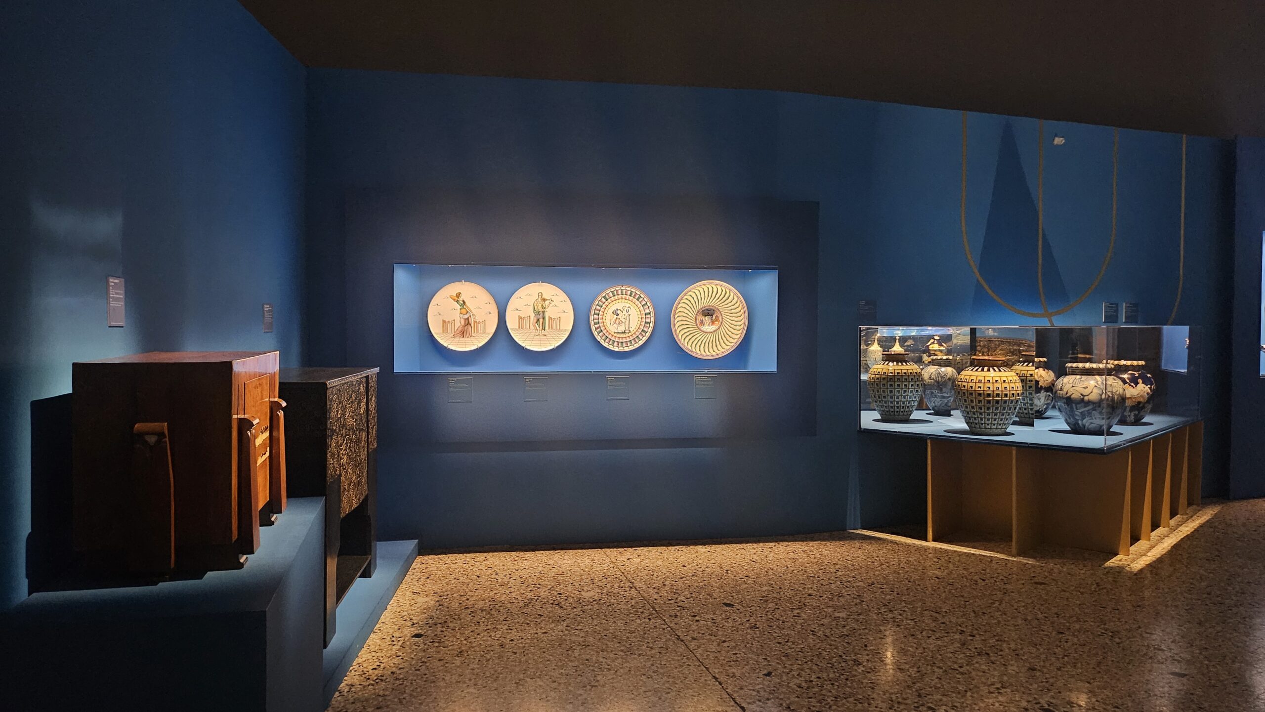
5. Monza Biennials: When Art Déco Took the Train to the Villa
Before Milan had the Triennale and glossy design weeks, there was Monza, land of fast cars and, apparently, fabulous ceramics. In 1923, the good folks of Italian design packed their painted vases, lacquered wood, and aesthetic ambitions into the Villa Reale and kicked off the first Biennale of Decorative Arts. It was like a chic village fair, except with a lot more gold and a lot less livestock.
Déco Moves In (And Rearranges the Furniture)
Under the guidance of Guido Marangoni, the event was split by region and aimed to celebrate artistic craftsmanship. Art Déco immediately stole the spotlight. You could spot it in the textiles, the furniture, the ceramics, especially in the works of Zecchin, Zaccari, and the rather glamorous ceramics from Laveno, thanks to Andlovitz. Not to mention the completely revamped Richard-Ginori pieces, courtesy of none other than Gio Ponti, who was already styling porcelain like it was haute couture.
1925: Paris Calls, Monza Answers
By 1925, the second Biennale was in full swing, perfectly timed to mirror the more famous Paris Expo, like a stylish younger sibling throwing its own party next door. The Art Déco language had started to dominate, with artists like Cambellotti, Pietro Chiesa, Carlo Rizzarda (yes, we are related), and Gio Ponti all showing off their design chops. Even France showed up (politely), though only with two rooms compared to nine from Germany, which, to be fair, had skipped the Paris event entirely.
1927: The Déco Era Goes Full Throttle
By the time the third Biennale hit in 1927, things got serious: Déco was no longer just an aesthetic flirtation, it was the main event. There was a whole room for the group “Il Labirinto”, and Richard-Ginori was now officially the Gucci of tableware. Ponti and Buzzi presented part of the Centrotavola delle Ambasciate, because apparently even diplomacy needs a little porcelain panache. If I placed that on my table, I wouldn’t have a dining room anymore. Or a house, for that matter.
1930: A Triennale Is Born (Sort Of)
Skipping 1929 (no explanation needed: Monza was having a moment), they came back strong in 1930 with a fourth edition. That was the last Biennale before it all got rebranded as the Triennale and moved to Milan, where the party continues today. Déco began to step back, stage left, as Novecento took over with its more “serious” architectural vibes, but that’s a drama for another room.
6. The French Version: Decadence, Deer, and Decorative Flair
Back to France, where even modernism wore perfume and travelled by velvet train. By the time the 1925 Paris Expo rolled around, the French expression of Art Déco had hit its full, glittering stride: dripping in luxury, dipped in lacquer, and firmly committed to the belief that le bon goût should always come with a monogram.
From the Salon to the Side Table
France had always been loyal to the idea of luxury as a birthright, and Art Déco gave it the perfect excuse to show off. But here’s the twist: while the elite still commissioned custom interiors and objets d’art, French Déco also found a way to appeal to the growing petite bourgeoisie. The solution? Slightly more affordable glam—let’s call it Ladurée on a budget. Fewer gold leaf finishes, but just enough stylised curves to make everyone feel like they were living in a Jean Patou ad.
Ceramics, Fawns, and Vienna Whispers
This wasn’t the sleek, stripped-down Déco of later years. No, the French version was fabulously decorative. You had ceramics from Sèvres, Pierre Petit painting enormous windows featuring fawns, Erté doing what Erté does best — ethereal watercolours full of sinuous lines and otherworldly fashion poses — Camille Fauré enamelling copper vases in abstract Vienna Secession style, just in case you needed a splash of Klimt with your floral arrangement. Meanwhile, folks like Dagobert Peche and Otto Prutscher were taking Vienna’s influence and giving it a French twist.
Welcome to the Geometric Lounge
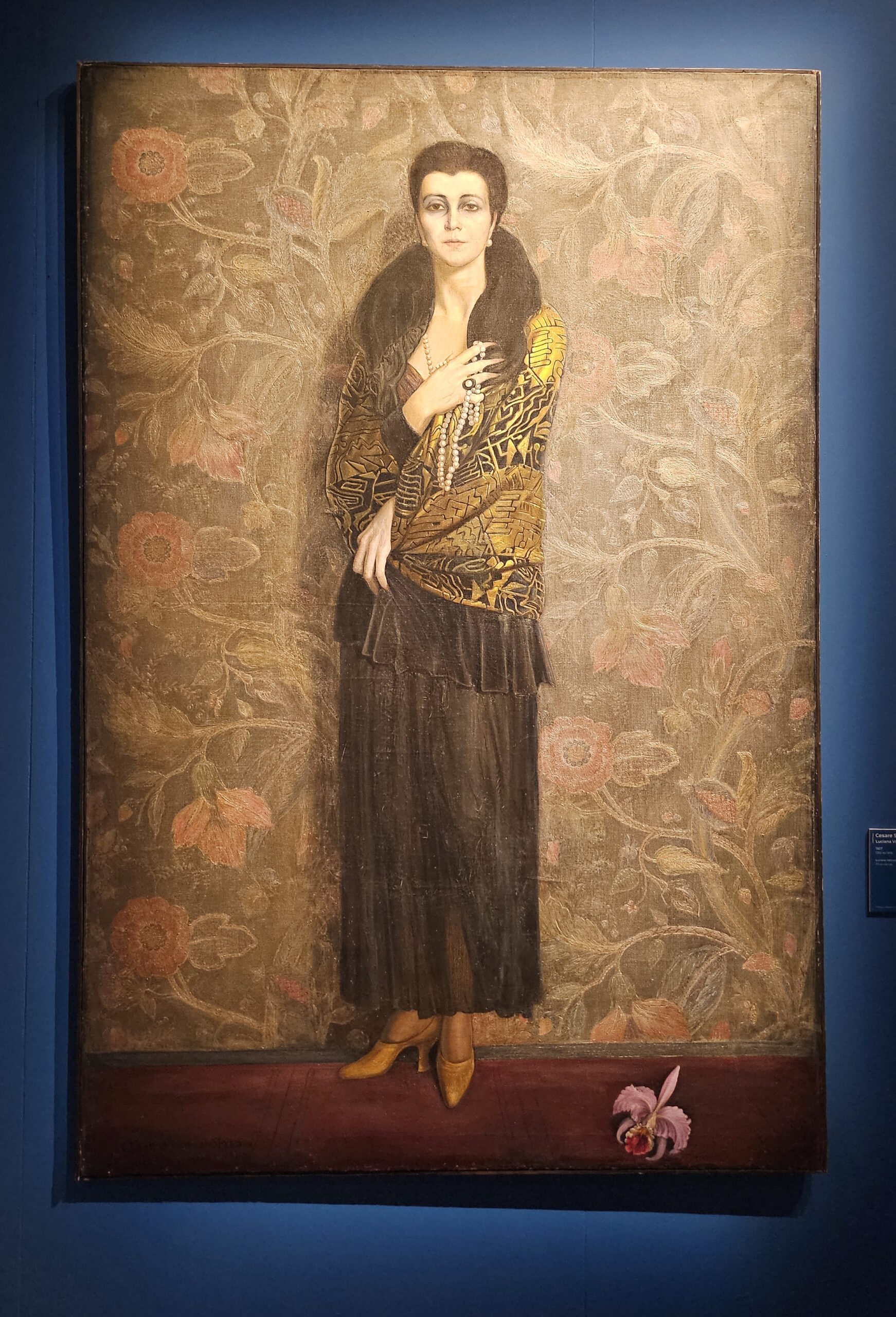
Designers like Jules Leleu, René Joubert, Philippe Petit, and the ever-stylish Jacques-Émile Ruhlmann began reworking 18th-century French forms into something cooler, cleaner, and decidedly more angular. Their interiors were what would happen if Versailles discovered Bauhaus but still insisted on embroidered cushions. And the muses? Oh, the muses were modern too. Like Wally Toscanini, painted by Alberto Martini with just enough ambiguity to suggest she might also be an interwar film noir heroine on the side. She’s the manifesto of the exhibition, and rightly so.
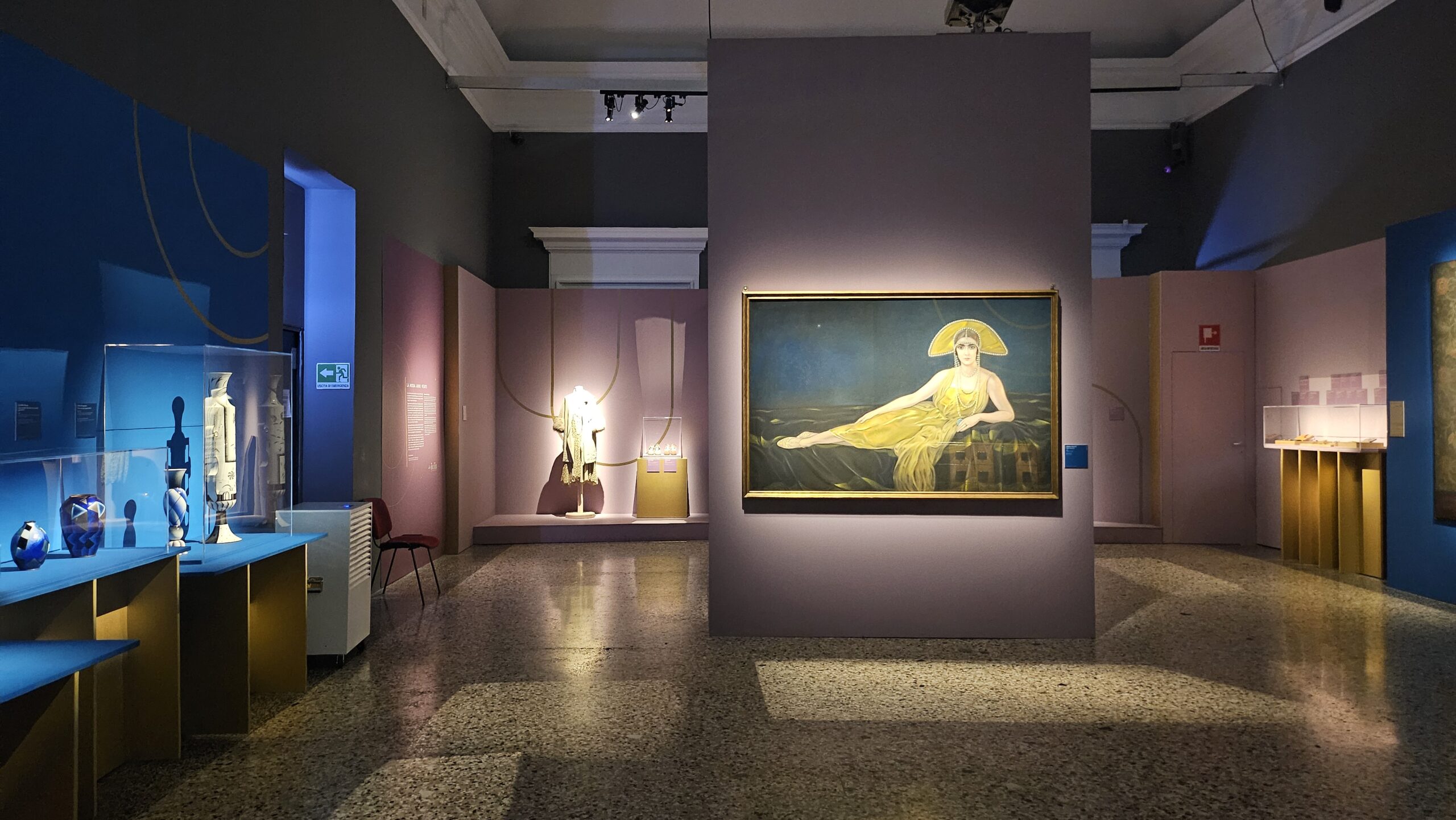
Draped in muted lavender and electric blue, her room is less gallery and more boudoir of a high-society spirit medium—if she also collected designer ceramics and wore embroidered jackets.
7. Flappers, Fabrics, and Freedom: Fashion Finds Its Swagger
The 1920s didn’t just bring jazz and cocktails: they brought a fashion revolution with a side of scissors. After World War I, with society in upheaval and traditional gender roles unraveling like a dropped hem, women weren’t just voting and working: they were dressing like they meant it.
Bye Corsets, Hello Garçonne
Enter the femme libérée of the Roaring Twenties. She chopped off her hair à la garçonne and stepped out in clothes that moved. Say goodbye to breathless corsets and hello to dresses designed for dancing, walking, and generally having a life. The new wardrobe staple? The straight-cut tunic dress. Waistlines were dropped to hip level (a radical shift both literal and symbolic), sleeves were optional, and breasts were — gasp — not a focal point. Scandalous? Absolutely. Comfortable? Even more so.
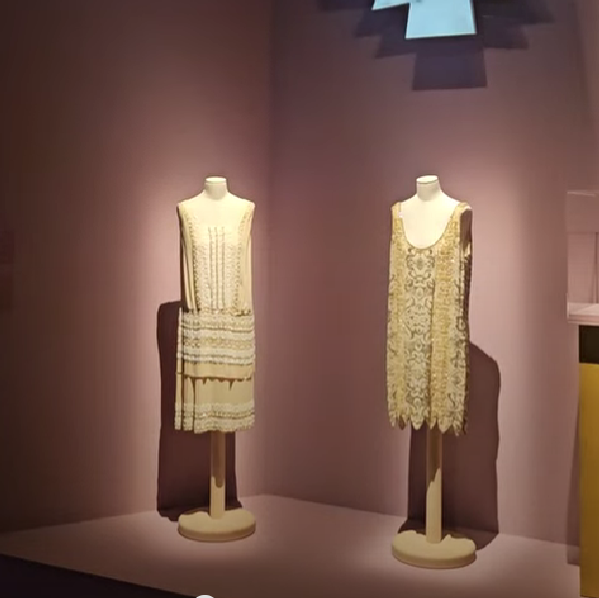
Accessories: Still a Girl’s Best Friend
Now, just because the silhouettes were simple doesn’t mean the women gave up glamour. Not a chance. Embroidered details, sparkling beadwork, and carefully chosen accessories did all the heavy lifting. A dress might be cut like a rectangle, but with the right brooch and shoes? Très chic. It was all about the line between elegance and casual, even if we didn’t have the word for it.
The Bias Cut Cometh
By the mid-1920s, fashion began playing with fabric in new ways. Thanks to the rise of bias-cutting (translation: cutting fabric diagonally to get that nice drape), dresses gained movement and flow without reverting to old, rigid tailoring. Skirts got longer again, but waistlines started inching back up. The androgynous figure remained the ideal, but with added flair. Freedom with a fringe, rebellion with a pearl necklace, and radical modernity softened by chiffon.
So yes, the 1920s were about far more than Charleston steps and sequins. They were a sartorial revolution dressed in dropped waists, bold silhouettes, and the glittering proof that women were done dressing for the drawing room. They were dressing for life, and living it loudly.
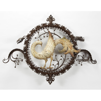
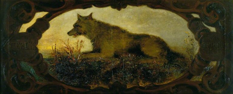
8. Gilded Beasts and Tropical Fantasies: When Art Déco Went Wild
Just when you thought Art Déco was all geometric mirrors and cocktail shakers, along comes this room to remind you that the movement also had a wild side. A very wild side. No wonder it’s one of my favourite rooms in the show.
Welcome to the jungle.
Or rather, the idea of the jungle, filtered through bronze, velvet wallpaper, and the slightly feverish imagination of early 20th-century European designers.
Life, Death, and Leopards on the Loose
Art Déco was fascinated — no, obsessed — with the untamed. Not in a cute “zebra-print cushion” way, but in the deeper, darker sense: nature as brutal, selection as savage, and beauty as something that might bite you. This wasn’t about Disney animals: it was about life and death, style edition.
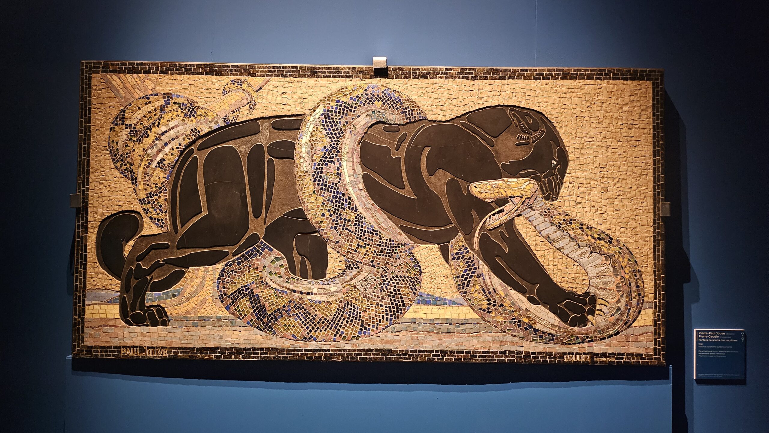
Artists, especially those working in the long tradition of animalier sculpture filled salons and spas with stylized echoes of the tropics: jaguars, vultures, panthers, and chimps, all rendered in gleaming bronze or dramatic stone. Vogue’s idea of taxidermy, if you will.
Biagini, Tofanari, and the Jungle as Decor
Two names lead this exotic parade: Alfredo Biagini and Sirio Tofanari. The latter is hailed as the great animal whisperer of Italian sculpture: he could coax a panther into a slab of marble like nobody else. Their creatures were moody, intense, ready to pounce or brood by the fireplace.
Biagini gave us Hamadryas baboons — just what your entryway needs, I guess — sinister vultures, and bronze lions with a gaze that could see into your soul. Tofanari threw in chimpanzees and slinking jungle cats, while glassmaker Lalique added glittering fish for good measure. And then there’s Pierre-Paul Jouve, whose mosaic of a black panther wrestling a python (above) might be the most dramatic living room accessory ever conceived.
Tamed Wildness in the Upper-Class Jungle
Of course, all this primal energy was carefully staged. These animals didn’t live in nature: they lived in the foyers of the rich, in grand hotels, in silent cinemas and spas. The wild was admired, but always behind glass or set into marble. It wasn’t a celebration of nature. It was domination with a decorative twist, and colonialism was looming over this approach. In this sense, Art Déco reveals its darker pleasures with exoticism. The savage becomes elegant, the jungle is domesticated, and mortality is rendered in glorious enamel. In a few years, history won’t provide such a glamorous death, and who’s better to encapsulate this contradictions than our very own Gabriele D’Annunzio?
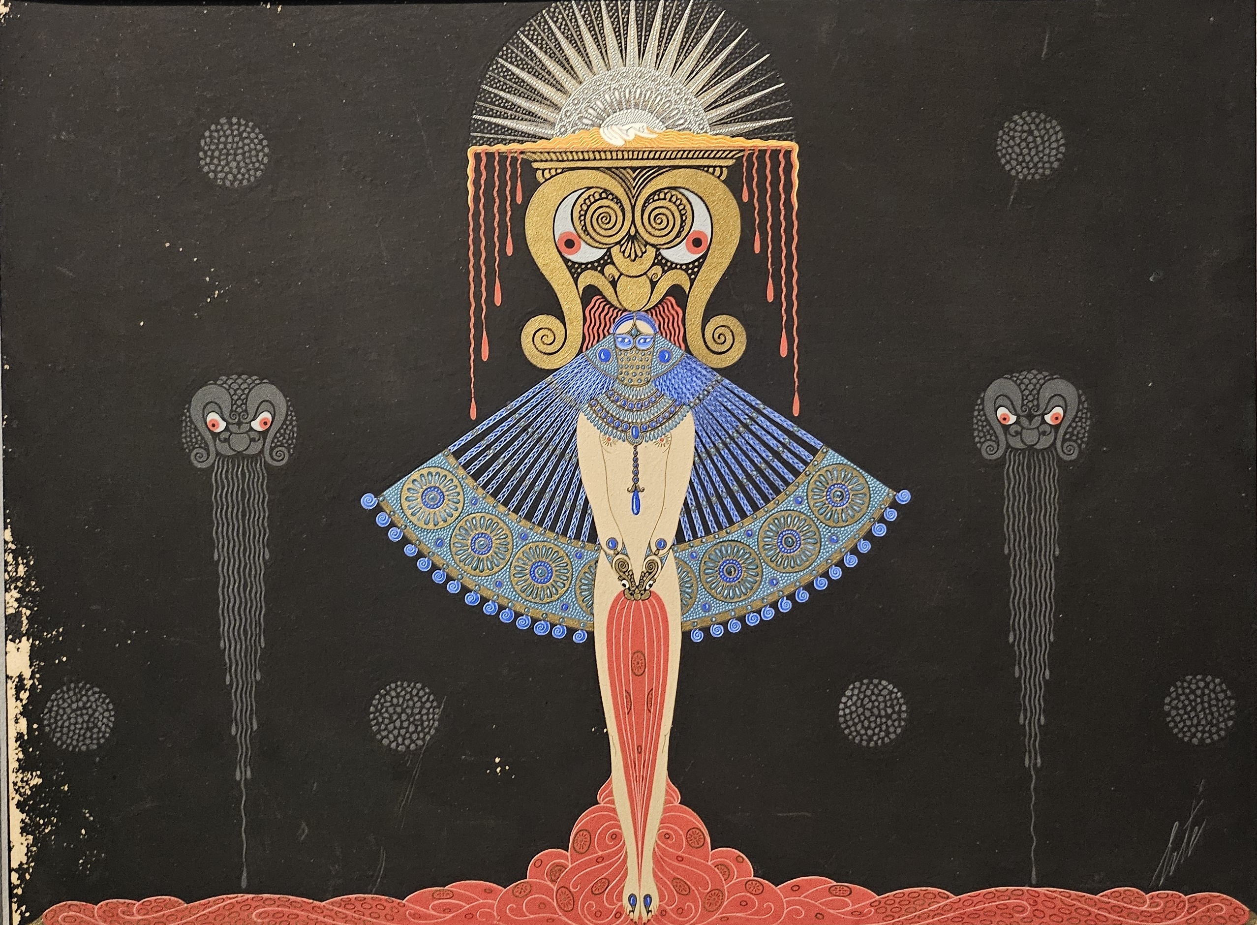
9. D’Annunzio Does Déco: Nature, Myth, and Maximum Drama
If Art Déco had a poet laureate of seductive excess, it would be Gabriele D’Annunzio, the man who never met a metaphor he couldn’t turn into a manifesto. His corner shifts the exoticism from animalier jungle drama to the rich, fragrant mythologies of Orpheus, Aphrodite, and the occasional endangered orchid. D’Annunzio wasn’t content with decoration: he was after transcendence. He saw beauty not as embellishment but as a force — a divine one — that could transform the soul, elevate the nation, and probably redecorate your salon while doing it.
Mythology Meets Modernism (But Make It Symbolist)
While Art Nouveau had offered serenity and floral swirls, D’Annunzio’s Déco was darker and more theatrical. Forget delicate nymphs; this was all about brooding gods, shimmering veils, and the erotic energy of redemption. His references to Orpheus (yes, the underworld’s favorite lyre player) weren’t casual, they were statements: music and poetry as ritual, art as salvation, design as a return to a mythical Paradise Lost. Subtlety? Not his forte. But the problem with him is another one…
Sensual Interiors and Political Undercurrents
While Art Déco often embraced exoticism as a motif, D’Annunzio weaponized it. At the Vittoriale (his personal Xanadu), every space was a stage where antique marbles and animal skins rubbed shoulders with futurist fantasies. His vision was synesthetic, ritualistic, and always one candle away from a séance.
By the time of the 1925 Paris Expo, this fusion of myth, nature, and design had matured into full-blown spectacle. Italy didn’t just bring craftsmanship: it brought an embroidered, incense-filled vision with a touch of imperial nostalgia and a splash of Symbolist perfume. And full-on sympathies for Fascism.
10. The Colonial Gaze: the Stereotypes of Exoticism
Where there’s Fascism, there’s people not minding their own businesses and trying to tell other people what to do. Oh, and murdering those who don’t.
In Europe’s lounges, violence was coated in exoticism. That curious cocktail of faux admiration, willful misunderstanding, and outright appropriation. And nowhere did it dance a finer line — literally — than on the Parisian stage of 1925, when Josephine Baker arrived like a whirlwind from Broadway wearing little more than charisma and a French designed skirt of bananas.
Let’s be clear: this wasn’t just a costume. It was a performance that electrified an audience with deeply colonial fantasy. Paris saw in her not a dancer, but a symbol: “la sauvage,” the wild, untamed muse of a world they didn’t care to understand, only to decorate. And she exploited it. Made fun of them in ways they didn’t understand.
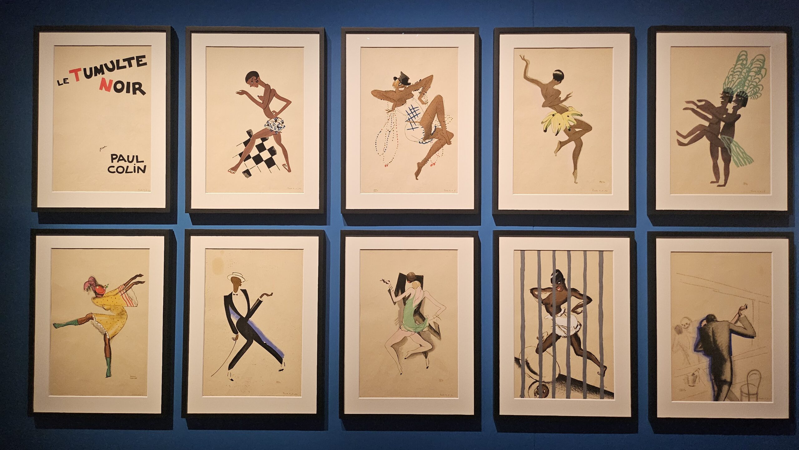
When Jazz Met Stereotype
Baker’s debut in La Revue Nègre was a sensation, but also a projection. The French public adored her, but through a prism of primitivism, racialized allure, and the dangerous glamour of “the other.” And the following year, her collaborator Paul Colin doubled down. His illustrated album Le Tumulte Noir embraced the jazz craze but also cemented the tropes: frenzied rhythm, exotic spectacle, and the myth of the “noble savage” reimagined for Art Déco interiors.
This wasn’t appreciation. It was a glossy, syncopated version of colonial gaze, a fantasy of Africa choreographed to ragtime and drawn in Deco lines. The “Negro” of the Parisian imagination was never real, of course. It was stylishly fabricated.
Art, Appropriation, and Acrobatics
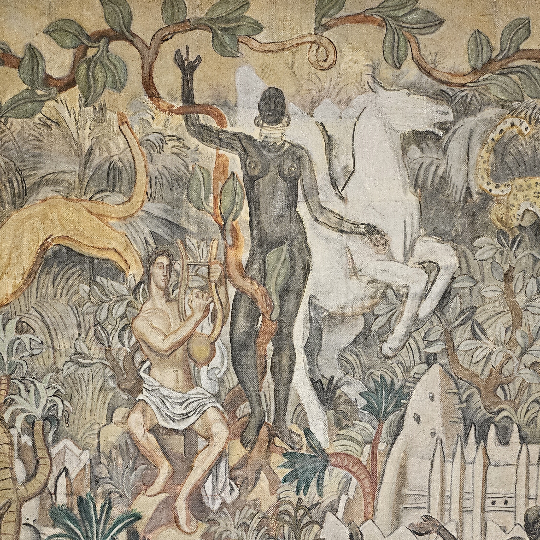
One of the strangest examples of this dynamic? A 1920s fresco by Louis Bouquet. A French vision of Africa with a village of Black dancers swirling around a divine white rider on a classical horse. Apollo meets acrobatics, and the message is as loud as a brass section. Europe rules the frame, and everyone else dances around it.
Even Baker, with all her revolutionary power and agency, was caught in this contradiction. She captivated Europe, yes, but on terms defined by others, costumed in otherness, staged as spectacle.
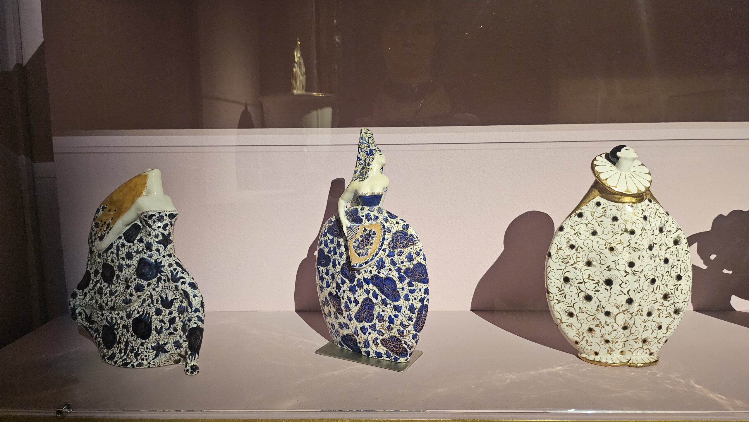
11. Silks, Shadows, and Salgari: When the ‘Orient’ Was in Vogue
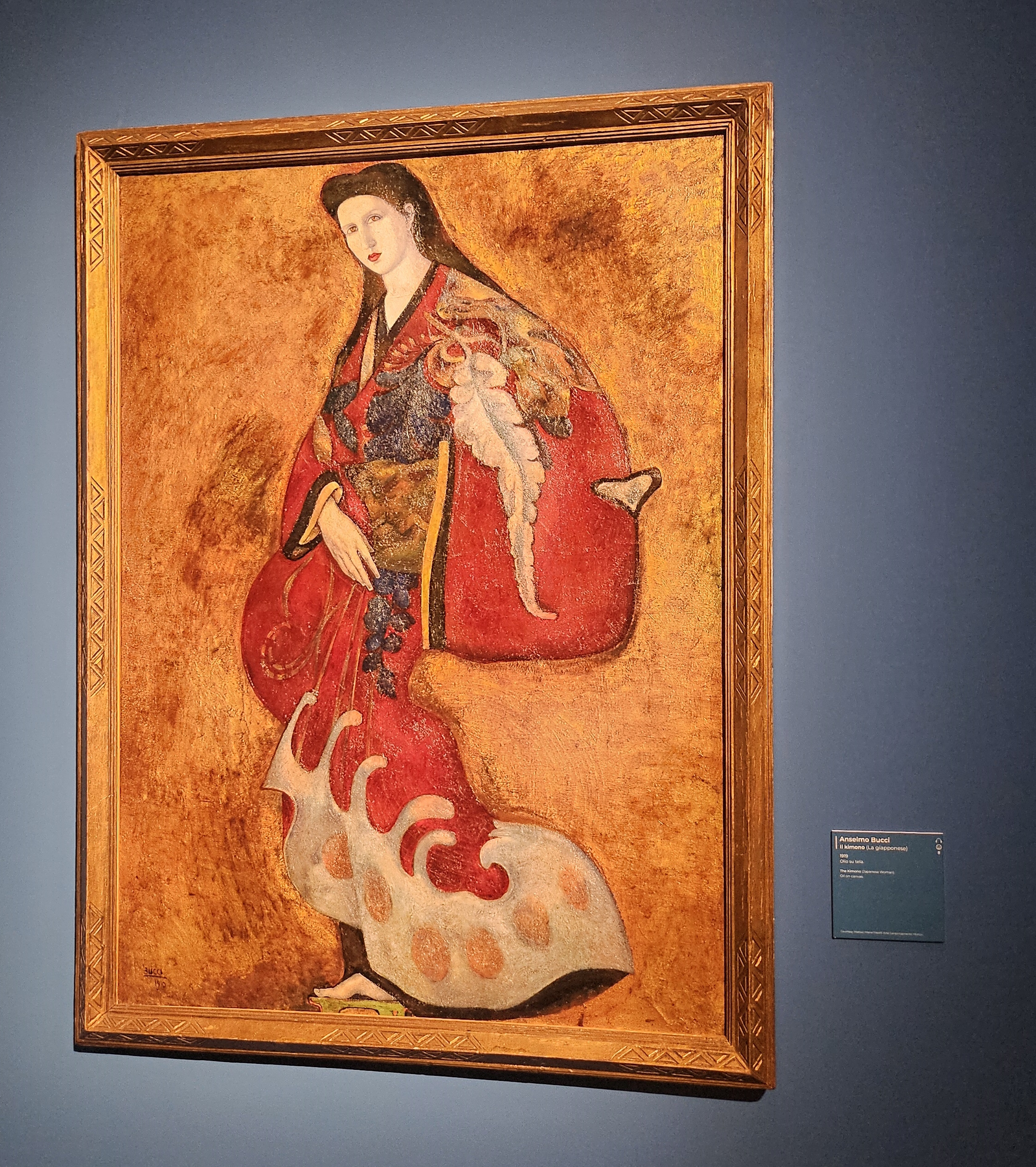
Not the real Orient, of course. We’re talking about the idea of the Orient, as seen through a French parfum bottle, an Italian art catalogue, or a very dramatic kimono draped over a chaise longue in a Paris salon. In the 1920s, no self-respecting Art Déco imagination could resist it. From Egypt to Japan, from Angkor Wat to Babylon, “the East” was reimagined as one big incense-scented fantasy.

The Pageantry of Not-Knowing
Francesco Nonni joined the club with his Corteo Orientale, exhibited in Paris in 1925 and again at the Monza Biennale in 1927. Imagine a scene that was at once sacred and seductive: a ceremonial procession meant to be both spiritual and sparkly, like a devotional parade accidentally designed by a Parisian costume house.
It was never really about understanding “the East.” It was about draping it in mystery, opulence, and just enough exoticism to make it marketable. Europeans didn’t want facts: they wanted kimonos (à la Anselmo Bucci), lotus flowers, and maybe a splash of Salgari for narrative spice. This wasn’t cultural exchange: it was visual escapism, silk-screened.
When Ballets and Bazaars Collided
Sergei Diaghilev’s Ballets Russes and their dreamy folkloric aesthetics became a design template across Europe. The real innovation? Not the choreography, but the costumes. Nijinsky’s shimmering silks and Rubinstein’s theatrical brocades spun a fantasy of Eastern promise that could be bottled, sold, and repurposed as haute couture.
And yes, Western designers — from Chéruit to the newly globalized luxury brands — took note. By the late 1920s, Oriental motifs were everywhere: embroidered into capes, painted onto lacquered screens, and tucked into boutique window displays between a bottle of perfume and a fan.
This chapter of Déco is less about geography and more about desire: a longing for a world of sensual curves, mythical dynasties, and whispered foreignness. It was as curated as it was imagined, where every silk thread carried the weight of both fascination and fantasy.
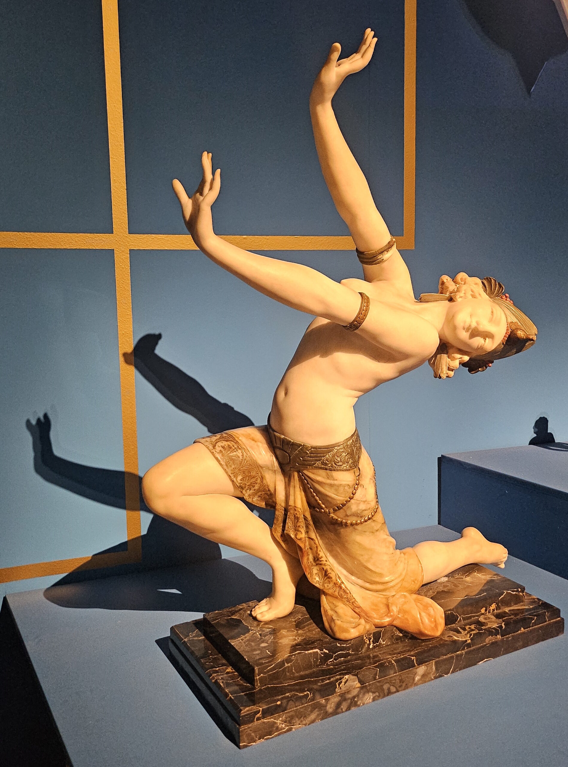
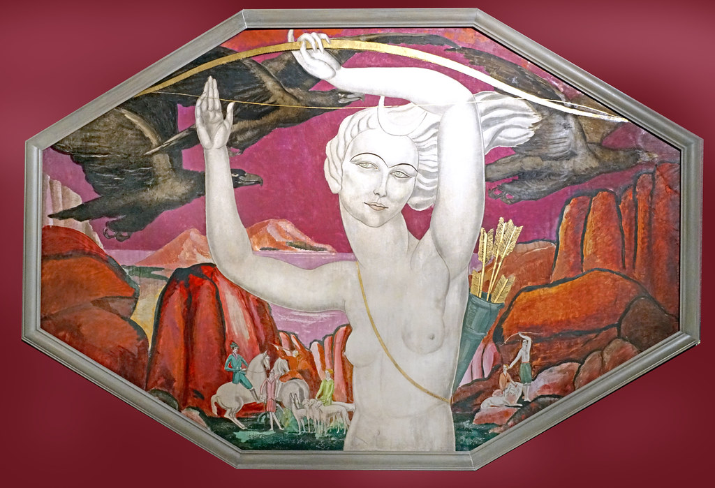
12. Goddess Mode: Diana, Nymphs, and the Mythologized Modern Woman
We’ve made it this far through Art Déco’s jungle of stylized beasts, shimmering silks, and colonial fantasies, only to emerge into the woods. But not just any woods. These are designer forests, where nymphs have impeccable posture, satyrs are mostly there for lighting contrast, and the goddess Diana rules with perfect eyeliner and a javelin.
In this chapter, Art Déco dips into ancient mythology not for history, but for vibes. It’s all about finding figures that feel modern, powerful, and just the right amount of dangerous, and no one ticks those boxes better than the goddess of the hunt, queen of the moon, and patron saint of the athletic-yet-glamorous woman.
Femme Fatale Meets Forest Spirit
Diana is presented by Art Deco not as a solemn divine figure, but as the ultimate archetype of eternal femininity: young, swift, and just a little bit scary. She’s seductive, but in a frosty, unbothered way.
Take Anne Carlu’s Diana: cold, radiant, and radiating something between a perfume ad and a moonlit threat. Or consider Gio Ponti’s Venatoria series, where young Amazons (all legs and perfectly waved hair) chase deer, slay them elegantly, and transport their prey like stage props. No gore, just myth with good posture.
Nature Rewritten in Deco Lines
This isn’t mythology à la museum: it’s mythology with stage lights. These women aren’t earthy goddesses in sandals but they’re stylized, choreographed, and vaguely resemble ballerinas who swapped tutus for daggers. The panel reassures us there’s “nothing sanguinary” here, and indeed there isn’t. Even when they’re hunting, these Dianas glide like they’re headed to a Vogue shoot.
This aligns with the general idea of wilderness in Art Déco: it isn’t… well, wild. It’s curated. The forest is lit from below, the nymphs have synchronized movements, and Diana is always camera-ready. Myth becomes metaphor; nature becomes design.
This chapter is where Art Déco tries to reconcile the past with the present, pulling figures from mythology and dressing them in satin and symbolism. Diana isn’t just a goddess; she’s a concept, a branding moment, and possibly the face of a luxury huntingwear line.
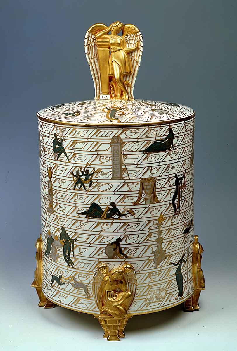
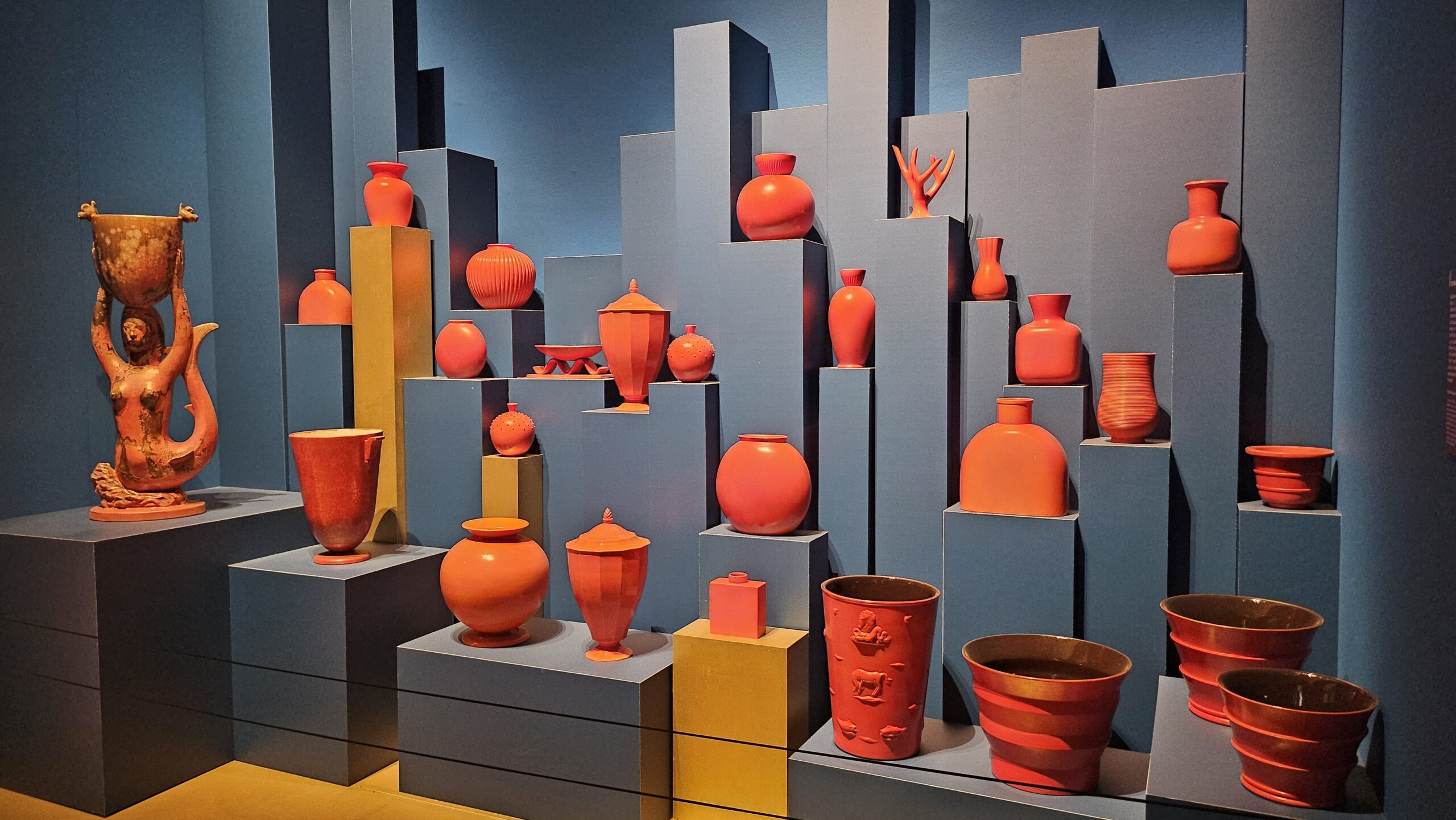
13. Gio Ponti’s Grand Tour: Antiquity in a Déco Dress
Just when you thought Art Déco had firmly planted its feet in the future, along comes Gio Ponti pulling out Etruscan urns, Renaissance arches, and a few metaphysical sirens for good measure. But make no mistake: this isn’t nostalgia. It’s a remix. In Ponti’s hands, classical mythology gets reimagined, stylized, and glazed into witty, dreamlike objects that would’ve confused Cicero but delighted Cocteau.
Cists, Conversations, and Curious Sirens
Ponti’s creations — like his now-iconic ciste, inspired by Etruscan bronze containers — whisper stories. In La conversazione classica for instance, ancient ruins are lovingly filtered. Il trionfo dell’Amore e della Morte brings in some romantic Renaissance architecture. And La migrazione delle sirene is Ponti’s metaphysical moment where sirens adrift in surreal, De Chirico-esque dreamscapes. More ink than inkling, more mood than myth.
The results aren’t archaeological replicas but cinematic allusions. The figures are half-myth, half-mannequin, and they don’t pose so much as float, trapped in a silent reverie somewhere between Pompeii and a Milanese showroom.
Women on Clouds, Flowers That Talk Back
In his series Le mie donne, Ponti turns his gaze to the female figure, with a tone that’s somewhere between affection and arch commentary. These aren’t your classical goddesses: they’re reclining nudes draped over golden clouds, lounging on bloated peony petals, and generally vibing in ways that would make Botticelli blush.
The references are crystal clear: part Mannerism, part Pre-Raphaelite fantasy, all filtered through the Deco obsession with clean lines and stylized forms.
So here, in the hands of Ponti, antiquity becomes neither burden nor blueprint but play material. He borrows from the past with a wink, redesigns its temples with a ruler, and have sirens living in a metaphysical editorial spread.
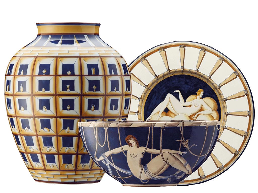
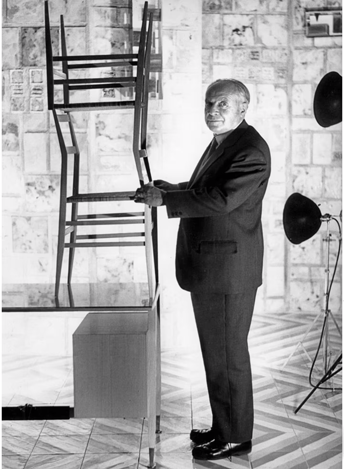
This is probably why there’s hardly anything more Art Deco than Gio Ponti, Milanese architect, ceramic alchemist, and high priest of stylish practicality. The Ponti who, while managing the Richard-Ginori ceramic empire, was firing off letters, attending monthly factory pilgrimages to Sesto Fiorentino, and casually reinventing how you could eat soup from something elegant.
Ponti graduated in 1919 and barely paused to exhale before launching into the profession. By 1922, he was managing the Milanese branch of Richard-Ginori, overseeing everything from the clay to the catalogues. His relationship with Luigi Tazzini, the technical brain at the Doccia factory, was the stuff of design legend: endless written exchanges, annotated sketches, and artistic debates.
Ponti’s secret weapon was a continuous dialogue with the technical side of the craft, and the ability to make ceramic feel contemporary without losing its soul. Whether he was sketching classical urns with a wink or streamlining silhouettes into something bold and geometric, he always blended grace with industrial ambition. By 1930, the numbers were astonishing: the Ceramiche moderne d’arte catalogue boasted nearly 200 models and over 350 decorative variations, each one touched by Ponti’s eye for elegance and editorial flair. It’s less a product line, more an aesthetic regime.
Then, in 1930, Ponti pivoted. He said goodbye to flamboyant Déco curlicues and embraced the cleaner, cooler lines of the Novecento style. A shift in mood, perhaps, or just a man keeping up with the times. But those years with Richard-Ginori were pure creative gold, equal parts industry and poetry, molded and fired. Next time you see a porcelain vase from this era, remember: it might look delicate, but it was born from fierce correspondence, bold experimentation, and a Milanese architect who made ceramics cool. We’ll call it Industrial Design, in a few decades.
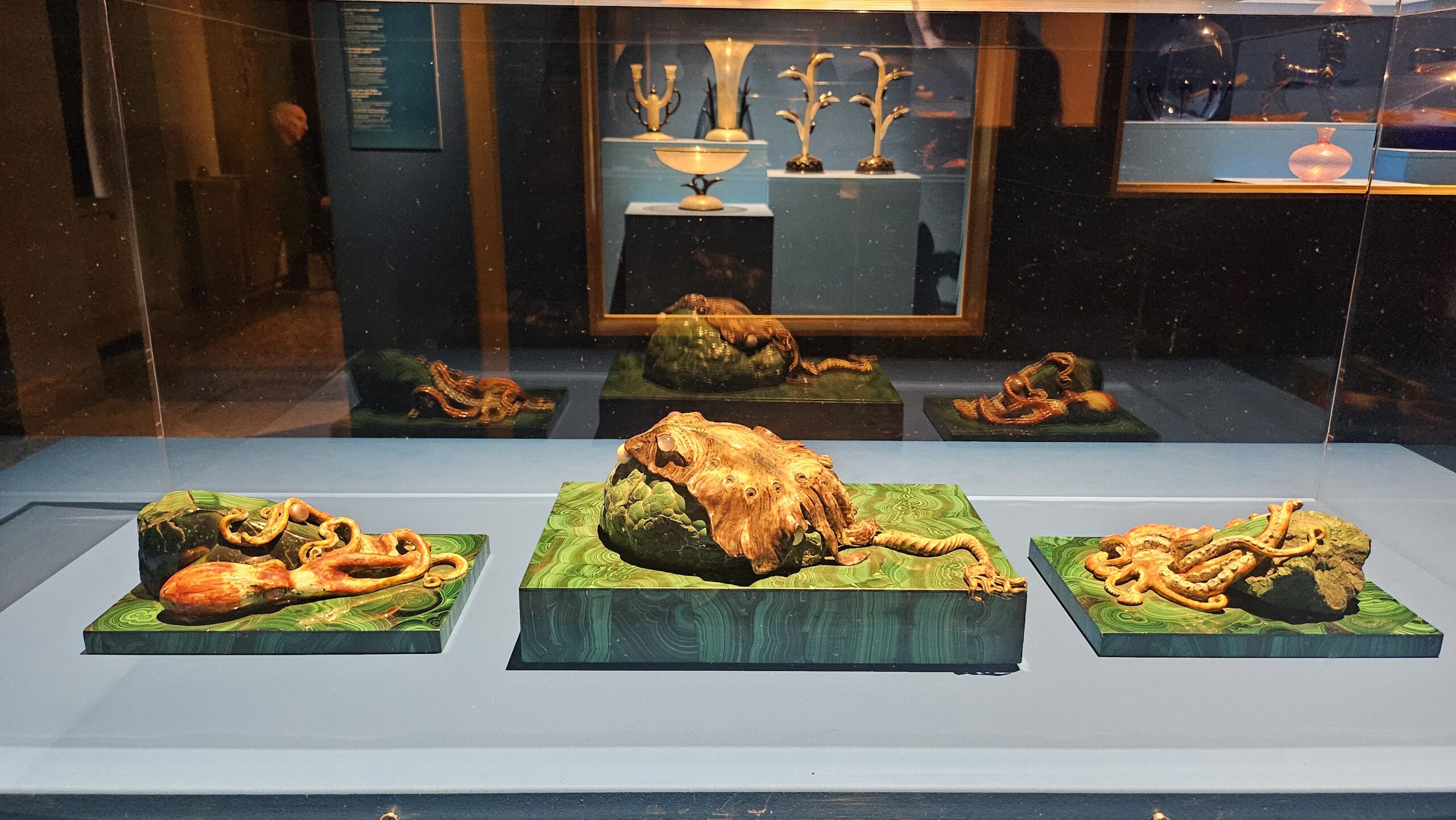
14. Cabinets of Curiosity (with Octopuses): The Art Déco Wunderkammer
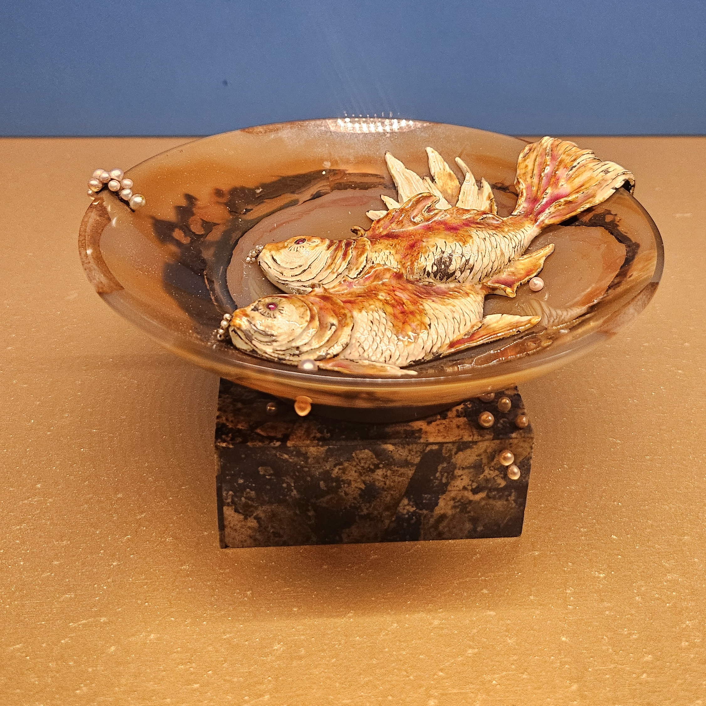
Step right up! We’ve now entering the Wunderkammer Déco, a cabinet of wonders where everything sparkles, glimmers, and whispers. It’s a place where nature meets artifice, glass meets gold, and stingrays share the stage with silver filigree. And my second-favourite room in the show.
Forget dusty taxidermy and faded maps: this is the Art Déco version of a curiosity cabinet. Blown glass that floats like air, centerpieces that include sea creatures, and goldwork that could hypnotize a Fabergé egg.
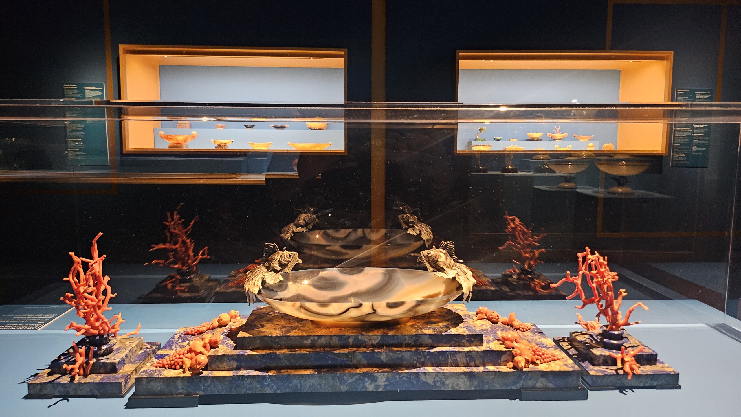
Glass, Gold, and Glowing Tentacles
Among the stars of this room are the transparent masterpieces of Vittorio Zecchin, so light they seem woven from breath and perfume. Alongside them, Ercole Barovier’s Vetri Primavera glisten like spring itself bottled into form: completely Déco, unapologetically elegant. Then there’s the Milanese master of golden detail: Alfredo Ravasco, with his refined craftsmanship. His pieces evoke the opulence of the 16th century, but scaled to the tabletop or brooch, like miniature monuments.
The focus of the room revolves around a centerpiece featuring a stingray and octopus created around 1935 by Angelo Campiglio and his wife Gigina Necchi (yeah, the ones of the villa Necchi-Campiglio). It’s part sea-life fantasy, part design fever dream, and all deliciously over-the-top.
From Showpieces to Style Shift
As the 1920s melted into the 1930s, Ravasco’s works became more complex. Even the smallest pieces took on architectural presence. His brooches might be the size of a coin, but they carried the drama of a Deco façade. These mini-marvels quietly signaled a stylistic transition, from the exuberance of Déco to the sleeker, more sober lines of the Novecento style.
15. The Grande Finale: When Déco Took Its Final Bow
By 1925, Paris had staged a spectacular exhibition that declared: enough with the dullness of daily life, let’s live in luxury, darling. Elegance became a lifestyle, and every ashtray had ambition. But while the world was still clapping, the curtain had already started to fall.
The Centerpiece to End All Centerpieces
Flash-forward to 1927. Gio Ponti and Tomaso Buzzi deliver their swan song in porcelain: the Centrotavola per le Ambasciate (yes, it sounds fancy because it is). Imagine a Venetian-style garden in miniature, but make it opulent. We’re talking tritons, seahorses, putti riding dolphins, trees and fountains made of white and gold porcelain, tiny architectural details fit for a Versailles diorama, and Italy in the centre, personified, sitting atop a shell like a nationalistic Botticelli. It’s exuberant, whimsical, and about one teacup short of baroque delirium. Art Déco at full maximalist throttle.

Too Much of a Good Thing
But then the sparkle starts to dim. The cheeky Rococo references, the dapper dandies and dreamy Amazons, the Charleston rhythm, the Orient-as-décor… all of it, once radical and radiant, was suddenly too much. The mechanical pulse of modern life outpaced the gilded lines. The unrelenting chase for aesthetic pleasure felt exhausted. Art Déco, with its ambition to dazzle, had reached the edge of its own invention.
By the early 1930s, the tone had shifted toward restraint, structure, and the Novecento’s cooler gaze.
Across Europe, what once had been delicate, witty, and decoratively extravagant gave way to something eavier. Plasticity replaced grace, monumentality replaced whimsy, and the flirtatious curves of Art Déco were straightened into ideological lines. The new motto was less dancing nymph, more marble-faced Mussolini. So yeah, fuck them.
Out went the intricate patterns and mythological references; in came austerity, tectonic geometry, and monochrome glazes. The regime’s autarky policies didn’t help. Materials became harder to import, luxury harder to justify. But some designers still worked wonders within constraints: Guido Andlovitz and Angelo Biancini (with their red stoneware masterpieces), and Ponti and Gariboldi at Richard-Ginori, who managed to keep things bold even without the gilded dolphins.
Meanwhile, in New York…
Back in the U.S., Déco wasn’t dying: it was having its Hollywood close-up. In 1930, the Chrysler Building made its spire-piercing debut, soon followed by the Empire State Building and a whole constellation of American skyscrapers, department stores, and cinemas channeling their inner jazz-age pharaohs. Many of these architectural fantasies were built by skilled Italian and French craftsmen who had brought the magic of European Déco across the Atlantic, just as Europe itself was packing up the sequins and putting on its ideological uniform.
So, while Déco dimmed under fascist shadows and rigid modernism, it lived on in Hollywood’s golden hour: camera-ready, architecturally tall, and still twinkling in the California sun.
Back in Europe? The party was over, and Novecento had turned the lights off.


1 Comment
Raffaella
Posted at 11:05h, 03 JuneAvevo letto della mostra qualche mese fa sul Sole 24Ore, e – come sempre accade – mi sono molto rammaricata di non poterla visitare. Questo tuo splendido articolo mi ha permesso di visitarla virtualmente, oltre che di arricchire le mie conoscenze su questo movimento che da sempre mi affascina. Complimenti per la tua analisi dettagliata e al contempo assai godibile e accessibile, oltre che per le bellissime foto!